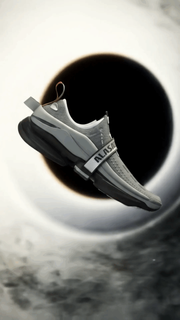
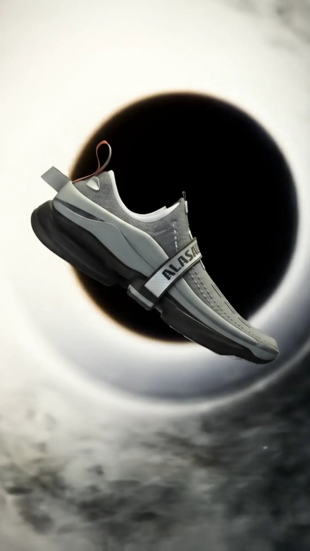
The Craft of 3D Typography
The Craft of 3D Typography… it’s kinda like pulling words right off the page and letting them hang out in real space. Think about it. Instead of just flat letters chilling on a screen or paper, these letters have weight, depth, shadows, and they can catch the light just right. For me, diving into this world wasn’t planned, but it grabbed hold of me and hasn’t let go. It started with messing around, honestly, seeing what happens when you give a simple letter ‘A’ some thickness and maybe a cool texture. Now, years later, The Craft of 3D Typography is a huge part of what I do and how I see design.
When I first heard about 3D typography, it sounded super technical, like something only rocket scientists or people who wear lab coats all day would do. But turns out, it’s more like being a digital sculptor or painter. You’re shaping letters, yes, but you’re also thinking about the environment they’re in, how light hits them, what they’re made of (digitally speaking), and how they make someone feel when they see them. It’s a whole different ballgame compared to just picking a cool font.
So, What’s the Big Deal with 3D Letters?
Learn more about 3D Typography
Alright, let’s break it down simply. You see type everywhere, right? On websites, posters, book covers, signs. Most of that is 2D – flat. The Craft of 3D Typography adds that third dimension. It makes the letters pop, stand out, and feel more substantial. Why would you want that? Well, for starters, it gets attention. Our eyes are drawn to things that look like they have depth, like they could exist in the real world. It can add a ton of personality and impact to a design.
Imagine a movie title. A flat title might be cool, but a 3D title? Suddenly, those letters can be made of ice, fire, metal, or crumbling stone. They can reflect the mood and theme of the movie instantly. Or think about an album cover. 3D type can turn the band’s name into a solid object, maybe futuristic chrome or gritty concrete, matching their sound and vibe. It’s about storytelling, even with just a few letters.
I remember working on a project for a local cafe. They wanted something for their sign that felt warm and inviting but also a bit modern. We could have just used a nice script font, but I suggested we try making their logo name in 3D, giving it a slightly rounded, wooden texture with soft lighting. The difference was night and day. It felt so much more welcoming and unique than a flat graphic ever could. That’s the magic of The Craft of 3D Typography.
My First Steps (Mostly Tripping)
Getting started with The Craft of 3D Typography was definitely a learning curve. I didn’t go to fancy design school for this. My journey was mostly fueled by curiosity and a whole lot of trial and error. My first attempts? Let’s just say they weren’t pretty. Letters looked lumpy, lighting was awful (everything was either pitch black or blown out white), and textures looked like they were painted on by a toddler with mud.
I started with some basic software, often free ones or trials, just to get a feel for moving around in a 3D space. It’s different from 2D design. You’re not just placing things on a canvas; you’re setting up a whole little universe for your letters. You need to think about where the camera is, where the lights are, and what the ground (if there is one) looks like. It was confusing! Rotating objects felt weird, zooming felt weird, everything felt… three-dimensional in a way my brain wasn’t used to.
Persistence was key. I watched a ton of tutorials online – some good, some not so good. I joined online communities and saw what other people were doing. I’d try to copy effects I liked, usually failing spectacularly, but learning little bits each time. I spent hours just trying to make a simple cube look right, understanding how light bounces off different surfaces. It felt like learning a new language, one spoken in vertices, edges, and polygons.
One of the biggest hurdles was understanding lighting. In 2D, you might add a shadow effect, but in 3D, light is everything. It determines how your letters look solid, how textures appear, and the overall mood. Too much light, and you lose detail. Too little, and you can’t see anything. Positioning lights felt like playing a guessing game for a long time. Soft shadows, hard shadows, colored lights – it was a lot to take in. But slowly, piece by piece, it started clicking. I began to appreciate The Craft of 3D Typography not just as design, but as a mix of design, sculpture, and even photography.

The Tools of the Trade (My Digital Toolbox)
You don’t need the fanciest, most expensive software to start, but having the right tools makes a huge difference as you get more serious about The Craft of 3D Typography. Over time, I’ve used a few different programs. Some are designed specifically for 3D modeling and rendering, others are more geared towards motion graphics but have strong 3D capabilities. Each has its quirks and strengths.
There are industry-standard programs that are incredibly powerful but can feel overwhelming at first. They let you build pretty much anything you can imagine, control every tiny detail, and create stunningly realistic images. Then there are programs that are maybe a bit simpler to learn, especially if you’re already familiar with other design software. These are great for getting your feet wet or for projects that don’t need super complex setups.
Beyond the main 3D software, there are other tools I use. A good 2D design program is still essential for planning, sketching ideas, or creating textures that I’ll apply to my 3D letters. Sometimes I need to edit images for textures or create masks. Also, a program for creating and editing fonts can be helpful if you want to start with a specific letter shape that doesn’t exist yet.
It’s not just about the software, though. Having a decent computer that can handle the processing power needed for rendering (which is basically the computer calculating what the final image will look like, including all the lights, shadows, and textures) is pretty important. Early on, waiting hours for a single image to render was common. Now, with better hardware and more optimized software, it’s faster, but it still takes time.
Understanding file types is another part of The Craft of 3D Typography toolbox. You deal with 3D models, texture images, lighting setup files, and the final rendered image files. It’s a whole ecosystem of digital assets you manage.
The Process: From Idea to Awesome 3D Letters
How do I actually make these 3D words happen? It’s not always a straight line, but there’s a general process I follow when working on The Craft of 3D Typography projects. It usually starts with an idea or a brief from a client.
1. Concept & Sketching: This is where I figure out what I want the letters to *be*. What’s the feeling? What material should they look like? What style fits? I usually sketch this out first, rough drawings of letter shapes and how they might look in space. I think about the mood and the message. Is it playful? Serious? Gritty? Clean?
2. Choosing/Creating the Base Type: Sometimes I start with an existing font, but often I’ll modify it or even create the basic shape of the letters myself. This is where the 2D design skills come in handy. I get the flat outline of the letters ready.
3. Bringing it into 3D: This is where the magic starts. I import the letter shapes into my 3D software. Then, I give them depth – making them thick, thin, rounded, sharp edges, whatever the concept calls for. This is like the initial sculpting phase in The Craft of 3D Typography.
4. Modeling & Sculpting (Adding Detail): Depending on the complexity, I might add more detail here. Maybe the letters need to look like they’re melting, breaking apart, or covered in intricate patterns. This is where you can really get creative with the form.
5. Texturing: This is how you make the letters look like they’re made of something real (or unreal!). I add textures – images that tell the software how the surface should look. Is it shiny metal? Rough concrete? Fuzzy fabric? Textures give the letters their visual identity and make them feel grounded in reality (or fantasy). Getting textures right is a huge part of The Craft of 3D Typography.
6. Lighting: As I mentioned, lighting is super important. I set up digital lights in the 3D scene. Where are they coming from? How bright are they? What color are they? This stage completely changes the look and feel of the 3D type. It can make it look dramatic, soft, harsh, or dreamy.
7. Camera Angle & Composition: Now I decide how the viewer will see the letters. I position the virtual camera, choosing the angle and framing. Just like in photography, composition matters. How do the letters sit in the frame? What’s the background? Are there other elements?
8. Rendering: This is the final step where the computer crunches all the information – the 3D model, textures, lighting, camera – and creates the final 2D image. This is often the most time-consuming part, but it’s where you see all your work come together.
9. Post-Processing: After rendering, I usually take the final image into a 2D editing program for touch-ups. Adjusting colors, contrast, adding effects like glow or depth of field. It’s like adding the final polish.
This entire process, especially for complex projects, can take hours, days, or even longer. There’s a lot of going back and forth between steps, tweaking things until they look just right. That’s the dedication required for mastering The Craft of 3D Typography.
Making it Look *Good* (Beyond Just Being 3D)
Just making a letter thick doesn’t automatically make it good design. The real skill in The Craft of 3D Typography comes from understanding design principles and applying them in a 3D space. It’s not just about the technical stuff; it’s about the artistry.
Lighting is Your Best Friend (and Worst Enemy): Seriously, I could write a whole book just on lighting in 3D type. Good lighting defines the shape of your letters, highlights the textures, creates mood, and helps the type stand out. Bad lighting can make everything look flat, muddy, or just plain ugly. Learning to use different types of lights – directional lights, point lights, area lights, environmental lighting – and how they interact with your materials is a continuous learning process in The Craft of 3D Typography.
Textures Tell a Story: The texture you choose for your letters says a lot. Is it smooth and shiny? It feels modern, maybe luxurious. Is it rough and rusty? It feels old, industrial, perhaps gritty. Does it look soft and fuzzy? It feels warm, friendly. Picking the right texture (or combination of textures) is crucial for conveying the right message. It’s not just about finding a cool image; it’s about how that image behaves on your 3D surface under your chosen lighting.
Composition and Camera Matter: How you frame your 3D type is just as important as how you make the letters themselves. Are you looking at it straight on? From a low angle to make it feel imposing? From above? What’s in the background? Is it simple or complex? The camera angle and overall composition guide the viewer’s eye and impact how they perceive the 3D letters. It’s like setting up a mini photoshoot for your words.
Color Schemes Tie It All Together: Just like in any design, color plays a massive role. The colors of your letters, the textures, the lights, and the background all need to work together. A well-chosen color palette can make your 3D typography pop and feel cohesive, while clashing colors can make it hard to look at. Understanding color theory helps a ton here.
Attention to Detail: It’s often the small things that make a big difference in The Craft of 3D Typography. Subtle variations in texture, tiny bevels on the edges of letters, realistic reflections, or carefully placed shadows can elevate a piece from okay to amazing. It’s easy to get the big shapes right, but refining the details takes time and practice.
There was this one project where I spent ages getting the lighting *just* right on some chrome letters. I wanted them to look sleek and futuristic. Initial renders looked dull. It wasn’t until I added a subtle environmental light, mimicking the reflections you’d see in a clean, modern space, that they truly started to shine. It was a small tweak, but it made all the difference. That’s a perfect example of how critical attention to detail and understanding light is in The Craft of 3D Typography.
Mistakes I’ve Made (So You Don’t Have To… Maybe)
Trust me, I’ve messed up A LOT while learning The Craft of 3D Typography. It’s part of the process. Here are a few classic blunders I’ve made (and still sometimes catch myself doing):
Ignoring the Basic Shape: Sometimes I’d get so excited about adding cool textures or lighting that I’d forget about the actual letter shapes. If the letters themselves aren’t readable or well-designed in the first place, no amount of fancy 3D effects will save it. Start with strong typography principles.
Overdoing the Effects: Adding too many bevels, too many textures, too many lights, too many everything. It’s tempting to use all the cool tools you have, but often, less is more. Clutter makes the design confusing and ugly. Keep it focused.
Bad Lighting, Duh: We talked about this, but it’s worth repeating. So many early pieces looked flat or amateurish purely because the lighting was off. It’s the single biggest factor in making 3D type look believable and impactful. Spend time on this!
Unrealistic Textures: Trying to make something look like metal, but the texture doesn’t have the right reflections or surface imperfections. Or making something look like wood, but the grain is way too big or too small. Pay attention to how materials look in the real world (or how they *should* look in your stylized world).
Wrong Scale: Sometimes, in the 3D program, things can look right in isolation, but when you add other elements or imagine them in context, the scale is all wrong. The depth might be too much or too little for the intended effect.
Ignoring the Background: Your 3D type doesn’t exist in a vacuum. What’s behind it? Is it a plain color? An image? Another 3D scene? The background needs to complement, not compete with, your letters. It’s part of the overall composition.
Learning to identify these mistakes in my own work and others has been crucial for improving my skills in The Craft of 3D Typography. It’s about developing a critical eye.
Pushing the Boundaries: Getting Weird and Wonderful
Once you get the hang of the basics of The Craft of 3D Typography, the fun really starts. You can begin to experiment and push the boundaries. What if letters aren’t solid? What if they’re made of liquid? Or smoke? Or tiny particles swirling around?
This is where things like simulations come in. You can simulate physics – making letters fall like dominoes, bounce like rubber, or explode into pieces. You can make things flow like water or billow like clouds. This adds animation and dynamic energy to The Craft of 3D Typography.
Think about abstract forms. Letters don’t have to look perfectly clean. They can be distorted, stretched, squashed, or intertwined in complex ways. You can blend typography with abstract shapes or organic forms, creating something entirely new.
Exploring different rendering styles is also a way to push boundaries. Not everything needs to look photorealistic. You can go for a stylized, illustrative look, a low-poly geometric style, a hand-painted look (digitally, of course), or even something that mimics traditional animation styles.
And then there’s interaction. The Craft of 3D Typography isn’t just for static images anymore. With web technologies and game engines, 3D type can be interactive. You can spin it around, change its material, or have it react to mouse movements. This opens up a whole new world of possibilities for web design and digital experiences.
One of the most exciting aspects for me is seeing how 3D typography is being used in augmented reality (AR) and virtual reality (VR). Imagine walking into a virtual space and seeing words floating around you, anchored to points in the real world or the virtual environment. That’s next-level Craft of 3D Typography!
This constant evolution is what keeps me hooked. There’s always a new technique to learn, a new effect to try, or a new way to combine elements. The tools get better, and artists find innovative ways to use them. It’s a field that’s always moving forward.
Where The Craft of 3D Typography is Heading
Looking ahead, I think The Craft of 3D Typography is only going to become more integrated into our digital lives. With the rise of AR/VR, 3D interfaces, and more powerful devices, seeing and interacting with 3D type will likely become more common.
We’ll probably see more automation in some areas, with tools making it easier to create basic 3D text quickly. But the real artistry, the unique visions, will still come from designers who understand the principles and have the skill to push the software to its limits.
Artificial intelligence might also play a role, perhaps assisting with generating textures or suggesting lighting setups, but the creative direction and the final polish will remain firmly in the hands of the human artist. The Craft of 3D Typography will continue to be a blend of technical skill and artistic intuition.
I also anticipate more convergence between 3D typography and other fields like motion graphics, game design, and even physical product design (using 3D printing for actual physical 3D letters). The lines between digital and physical creation are blurring, and 3D type is right there in the mix.
Think about personalized experiences. Imagine websites where the typography subtly changes and adapts in 3D based on your preferences or interactions. That kind of dynamic, responsive design is becoming more feasible. The Craft of 3D Typography can make interfaces feel more alive and engaging.
Overall, the future of 3D typography looks bright and exciting. It’s a field with endless potential for creativity and innovation. The Craft of 3D Typography is here to stay and will likely evolve in ways we can’t even fully predict yet.
Tips for Anyone Wanting to Dive In
If reading this got you thinking, “Hey, maybe I could try that!”, here are a few tips based on my own journey into The Craft of 3D Typography:
- Just Start: Don’t wait until you have the perfect software or the perfect idea. Download a free trial or a basic program and just mess around. Make some letters, give them thickness, add a light. Experiment!
- Learn the Basics First: Before trying to make complex, melting letters, learn how to make a simple, clean 3D letter look good. Understand the tools for extruding (giving depth), beveling (rounding edges), and basic navigation in 3D space.
- Watch Tutorials (But Don’t Just Copy): Tutorials are great for learning *how* to do things. Follow along, but then try to apply the technique to your own ideas. Don’t just endlessly replicate what others do. Use tutorials as building blocks for your own creativity in The Craft of 3D Typography.
- Focus on Lighting and Textures: Seriously, I can’t stress this enough. Spend time learning about how light behaves and how to apply and adjust textures. These two things will make the biggest difference in the quality of your work early on.
- Study Real-World Materials: Look at how light hits metal, wood, glass, or plastic in real life. Observe the reflections, the shadows, the subtle imperfections. Try to recreate those observations in your 3D work.
- Get Feedback: Share your work online in friendly communities. Ask for constructive criticism. People with more experience can often spot things you missed. Be open to learning and improving.
- Be Patient: Learning 3D takes time. Don’t get discouraged if your first attempts don’t look like the professional work you see online. Every artist started somewhere. Keep practicing, and you will improve. The Craft of 3D Typography is a marathon, not a sprint.
- Experiment with Different Styles: Don’t feel pressured to stick to one look. Try making clean, modern 3D type one day, and messy, abstract type the next. See what you enjoy and what you’re good at.
- Stay Inspired: Look at the work of other 3D artists, not just typographers. Look at photographers, sculptors, architects. Inspiration can come from anywhere and fuel your creativity in The Craft of 3D Typography.
It’s a challenging but incredibly rewarding journey. There’s a unique satisfaction in seeing a word you designed pop out of the screen with depth and presence. The Craft of 3D Typography is a blend of technical skill and pure artistic vision, and that’s what makes it so fascinating.
This whole process of learning and creating in 3D has taught me so much, not just about design and software, but about problem-solving and perseverance. There are countless times I’ve hit a wall, where something wasn’t working or I couldn’t figure out how to achieve a specific look. It forces you to break down the problem, try different approaches, and learn new things along the way. That constant challenge and the feeling of finally getting something right is a major part of why I love The Craft of 3D Typography so much. It pushes you creatively and technically.
I remember one project where I wanted to create type that looked like it was carved from ice, with subtle transparency and frosty edges. Getting the light to pass through realistically and create those cold, crisp reflections took ages. I tried different material settings, played with light colors and intensities, and adjusted the environment around the letters. It was frustrating at times, but when the final render came through and the ice looked convincingly cold and fragile, it was a fantastic feeling. That’s the kind of deep dive into detail and realism that The Craft of 3D Typography allows for, and it’s incredibly satisfying when you nail it.
Another time, I wanted to make letters that looked like they were made of flowing gold liquid, catching highlights and forming little drips. This involved learning about fluid simulations within the 3D software. It was complicated and required a lot of computing power and tweaking of parameters – surface tension, viscosity, gravity. The simulation would run, and the letters would look like blobs, or they’d fly apart. It took many iterations and much patience to get that smooth, viscous look. But when the simulation finally behaved the way I wanted and the final render showed those beautiful, flowing golden forms, it felt like I had achieved something truly unique. This kind of complex, dynamic effect is part of the advanced realm of The Craft of 3D Typography and shows how far you can take it.
The beauty of The Craft of 3D Typography is that there are so many different styles and approaches. You can create sharp, architectural type, soft, organic forms, playful cartoonish letters, or hyper-realistic renders that look like photographs. You can make type that feels futuristic, vintage, handmade, or digital. This versatility means you can always find a new challenge or a new avenue to explore within the field. It never gets boring because the possibilities are truly endless.
Sharing my work and seeing others react to it is also a great part of the process. When someone sees a piece of 3D typography I created and says, “Wow, how did you do that?” or tells me they felt the exact mood I was trying to convey, it’s incredibly rewarding. It shows that the effort put into understanding lighting, textures, and composition pays off and that the design is connecting with the viewer on an emotional level. That connection is a big part of what drives me in The Craft of 3D Typography.
Getting comfortable with the technology is definitely a hurdle initially. Each software has its own way of doing things, its own interface, its own set of quirks. It can feel like learning a new video game with really complicated controls. But once you start navigating the 3D space more easily, understanding the menus, and knowing where to find the tools you need, the software fades into the background, and you can focus more on the creative side. The technical becomes a means to an artistic end in The Craft of 3D Typography.
It’s also important to remember that while the tools are digital, the underlying principles of good design still apply. Hierarchy, contrast, balance, rhythm – these are just as important in 3D typography as they are in 2D layout. Making letters stand out, ensuring they are readable (unless the artistic intent is otherwise), and creating a visually pleasing composition are fundamental regardless of the dimension you’re working in. The Craft of 3D Typography builds upon traditional design knowledge.
For anyone feeling intimidated by the technical aspect, my advice is to take it one step at a time. Don’t try to learn everything at once. Start with making a simple letter form, add some basic depth, put a simple light in the scene, and render it. Celebrate that small victory! Then, in the next session, learn how to add a basic texture. Then learn about adding a second light. Build your skills gradually. Rome wasn’t built in a day, and neither is mastery of The Craft of 3D Typography.
Community is also a huge resource. Finding other people who are learning or working in 3D typography provides support, allows you to ask questions, and gives you a place to share your progress and get valuable feedback. Seeing what others are creating can also be incredibly inspiring and push you to try new things. The online community around The Craft of 3D Typography is generally very welcoming and helpful.
The iterative nature of 3D work can also be a challenge. You render an image, see something you don’t like, go back and tweak the lighting or texture, render again, see something else that’s off, tweak again, and so on. It requires patience and a willingness to refine and revise. It’s rare that the first render is perfect. Learning to analyze your renders and identify what needs adjustment is a skill in itself within The Craft of 3D Typography.
Sometimes, despite all the planning and effort, a piece just doesn’t work. Maybe the concept didn’t translate well into 3D, or the technical hurdles were too high for the time available. Learning to accept that not every project will be a masterpiece and knowing when to set something aside is also part of the journey. But even failed projects teach you something valuable that you can apply to the next one.
The joy comes in those moments when everything clicks. When the lights hit the textured surface exactly as you imagined, when the composition feels balanced, and the 3D type conveys the intended mood and message powerfully. Those moments make all the hours of tweaking and rendering worth it. That’s the payoff in The Craft of 3D Typography.
It’s a blend of left-brain technical thinking and right-brain creative expression. You need to understand coordinates and parameters, but you also need an eye for aesthetics and a feel for form and light. It’s a unique intersection of art and technology, which is probably why I find The Craft of 3D Typography so endlessly captivating.
So, if you’re someone who loves letters, loves design, and is curious about bringing things to life in a digital space, I’d definitely encourage you to explore The Craft of 3D Typography. It’s a journey that requires dedication, but the rewards are immense, both creatively and technically. You get to sculpt words, build little light-filled worlds for them, and create visuals that truly stand out. It’s pretty awesome, if I do say so myself.
Conclusion
Stepping into The Craft of 3D Typography has been one of the most rewarding parts of my creative life. It’s a field that constantly challenges me, pushes me to learn new things, and allows me to express ideas in a way that 2D design just can’t. From those early, clumsy attempts to creating pieces that feel solid and real, the journey has been filled with learning, experimenting, and a whole lot of patience.
It’s more than just making letters thick; it’s about sculpting with light, painting with textures, and composing images in a virtual space. It’s a craft that requires both technical know-how and artistic vision. And for me, it’s a source of endless fascination and creative possibility.
If you’re curious to see more of what’s possible in this exciting area, or just want to learn a bit more, check out my website or dive deeper into this specific topic at The Craft of 3D Typography section.