
Mastering 3D Materials… that phrase used to sound like something only wizards or super-techy folks could do. For years, I fiddled around in 3D software, making shapes and models, but they always looked… well, flat. Like cheap plastic toys. No matter how cool the model was, if the surface looked wrong, the whole thing fell apart. It was frustrating! I’d see amazing artwork online, things that looked real enough to touch, and I knew the secret wasn’t just the shape of the object, but what it was made of – or at least, what it *looked* like it was made of. That’s the power of Mastering 3D Materials. It’s where the magic really happens, turning bland geometry into something that feels alive, something with history, something that tells a story. It wasn’t an overnight thing, learning this stuff. It was a journey filled with trial and error, clicking sliders and seeing weird things happen, watching tutorials late at night, and getting genuinely excited when a surface finally looked just right. Like when a metal object finally caught the light like *real* metal, or a piece of fabric looked soft instead of hard. That’s the moment you start feeling like you’re not just making models, you’re crafting worlds.
So, What Exactly ARE 3D Materials? (And Why Should You Care?)
Okay, let’s break it down super simple. Think about anything around you right now. The mug you might be holding, the desk your computer is on, the shirt you’re wearing. They all have different surfaces, right? Some are smooth and shiny, some are rough, some are soft, some are see-through. In the real world, this is because of the actual stuff they’re made from – ceramic, wood, cotton, glass. In 3D, we don’t have real ceramic or wood or cotton. We have numbers and settings that *pretend* to be those things. A “material” in 3D is basically a set of instructions that tells the computer how the surface of your 3D model should look and how it should react to light. It’s like putting clothes on your model, but these clothes determine everything from color and texture to how shiny it is or if you can see through it.
Why care? Because without good materials, your amazing 3D model will always look fake. A stunning car model looks like a cheap toy if its paint doesn’t reflect light properly and its tires look like featureless grey tubes. A detailed character model looks weird if their skin looks like plastic. Mastering 3D Materials is what breathes life into your creations. It’s what makes a stone wall look rough and ancient, a piece of metal look cold and hard, or a piece of fruit look juicy and ripe. It’s the difference between a flat, lifeless image and something that pops and feels real. It’s not just about making things look pretty; it’s about making them *believable*. Whether you’re making stuff for games, movies, cool pictures, or even 3D printing, understanding materials is absolutely key.
The Building Blocks: Color, Shininess, and Texture
When I first started, materials felt like this big confusing mess of sliders and checkboxes. But once I figured out the main ideas, it got way easier. The most basic things you control with a material are color, how shiny it is, and its texture.
Color (Albedo/Base Color)
This is the most obvious one, right? What color is the thing? In 3D, we often call this the “Albedo” or “Base Color”. It’s the pure color of the surface without any shadows or highlights baked in. Think of it as the color you’d see if you looked at the object under perfectly even, flat, white light. It’s not affected by how shiny it is or how rough it is. It’s just… its color. Picking the right base color is step one in Mastering 3D Materials. Sounds simple, but even this can be tricky. Sometimes a color that looks good on its own looks weird when applied to a model and lit. You learn to adjust. You learn that subtle variations in color can make a big difference.
Shininess (Smoothness/Glossiness)
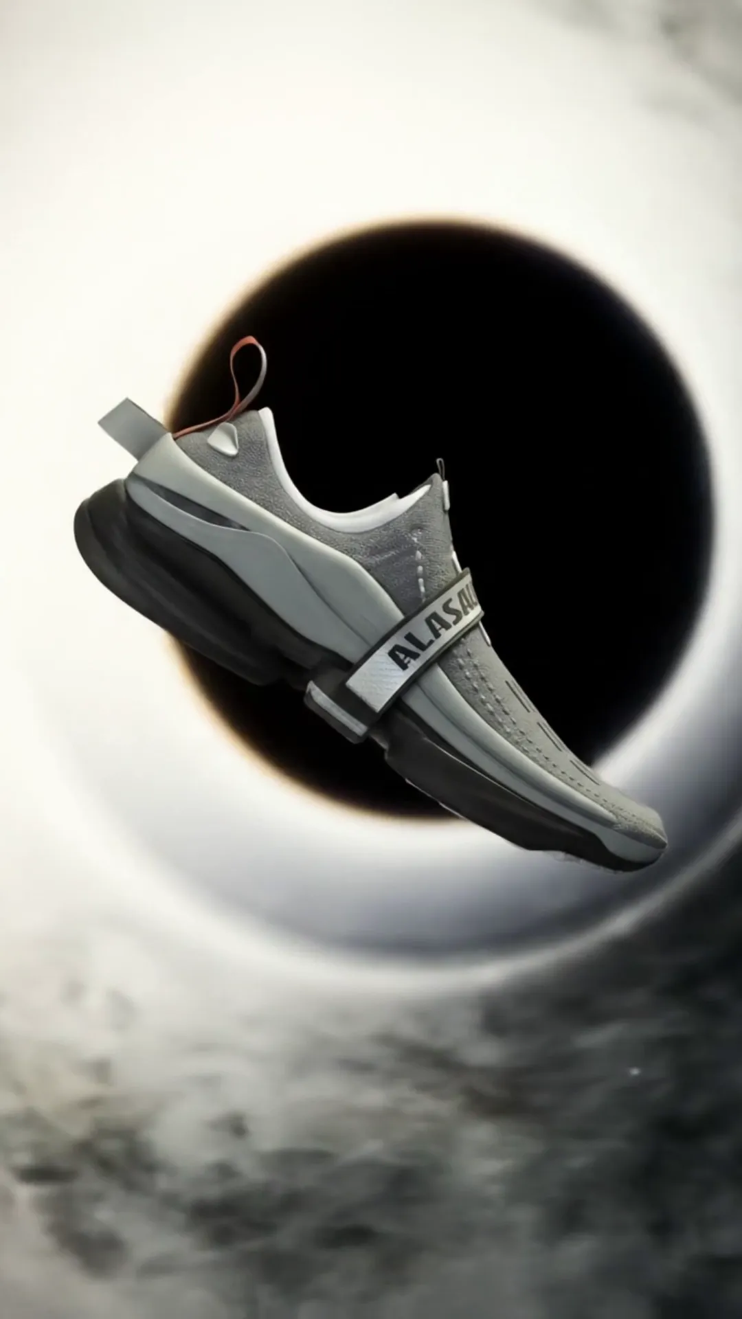
Now, this is where things get interesting. Shininess, sometimes called Smoothness or Glossiness, is about how much light bounces directly off the surface back to the viewer. A super shiny object, like a polished mirror or wet paint, reflects light sharply. A less shiny object, like matte plastic or unpolished wood, scatters the light more. This is a huge part of what makes something look like plastic, metal, wood, or stone. A common way to control this is with a “Roughness” setting (which is the opposite of smoothness – low roughness means high shininess, high roughness means dull). Getting the shininess right is crucial for realism. A metallic object that isn’t shiny enough just looks like grey plastic. A piece of fabric that’s too shiny looks like vinyl. Mastering 3D Materials means understanding this balance.
Texture (Texture Maps)
Color and shininess are good, but they make the surface look uniform. Most real-world objects aren’t perfectly smooth or a single solid color. They have details like wood grain, scratches, fabric weaves, or bumpy stone surfaces. This is where textures come in! A texture in 3D is usually an image (like a JPG or PNG file) that we wrap around our 3D model. We can use texture images for the color (a wood grain image for a wooden chair), but we can *also* use them to control other properties, like shininess or roughness. Imagine using a texture image where the dark parts mean “super rough” and the light parts mean “super smooth”. This is how you make something look like it has rough patches and smooth worn spots, all on the same surface. Textures add incredible detail and realism. Using textures effectively is a huge part of Mastering 3D Materials.
Stepping Up: Physically Based Rendering (PBR)
Okay, if you spend any time looking into Mastering 3D Materials these days, you’ll hear the term “PBR”. Don’t let it sound scary! PBR stands for Physically Based Rendering. It’s a fancy way of saying that the materials behave more like how light interacts with surfaces in the real world. Before PBR became common, artists often had to fake how light worked, making things look good from one angle but maybe weird from another. PBR materials use settings that are based on real-world physics, making them look much more consistent and realistic under different lighting conditions. It’s the standard now, and learning the PBR workflow is key to modern Mastering 3D Materials.
PBR materials usually rely on several different “maps” or texture images, each controlling a specific property. We already talked about Base Color (Albedo) and Roughness (which controls shininess). But there are a few others that are super common and super important:
- Metallic Map: This map tells the 3D software whether a part of the surface is metal or not. Metals behave very differently with light than non-metals (like plastic, wood, stone). Metals usually have color in their reflections, while non-metals have color in their base color. This map is usually just black and white – white means “it’s metal here,” black means “it’s not metal here.” Some materials are either fully metal or fully non-metal, but this map lets you have things like painted metal where some parts are paint (non-metal) and scratches show the metal underneath (metal).
- Normal Map: This one is a game-changer for detail without adding lots of extra geometry (polygons). A normal map uses color information (specifically, the red, green, and blue channels correspond to the X, Y, and Z directions) to fake bumps and dents on the surface. It tricks the light into reacting as if there were actual bumps, even though the 3D model’s surface is flat. This is how you get incredibly detailed surfaces like bumpy concrete, woven fabric, or engraved patterns without making your 3D model super heavy and slow to work with. Mastering 3D Materials often involves Mastering Normal Maps. They are essential for adding realism and detail efficiently.
- Ambient Occlusion Map (AO): This map helps add subtle shading in creases and corners where light doesn’t easily reach. It adds a little bit of soft shadow that makes the object feel more grounded and gives it depth, especially in areas where different parts meet. It’s usually a grayscale map, where darker areas indicate places that should be more shaded by nearby geometry. It’s a subtle effect, but it makes a big difference in how “real” an object feels.
- Height/Displacement Map: Similar to a normal map, but this one can actually push and pull the geometry of the model itself, creating real bumps and valleys. This is usually used for larger details that need actual shape change, like rocky ground or deeply carved patterns. It’s more powerful than a normal map but also uses more computer resources, so it’s used more selectively.
- Emissive Map: This map makes parts of your object look like they are glowing or emitting light, even if there isn’t a light source there in your scene. Think of screen displays, neon signs, or hot metal. This map tells the software which parts should look like they’re glowing and what color that glow should be.
- Alpha/Transparency Map: This map controls which parts of your object are see-through. White might mean fully solid, black might mean fully transparent, and shades of grey mean semi-transparent (like frosted glass). Useful for things like leaves (cutting out the leaf shape from a square plane), fences, or anything you need to be partially or fully invisible.
Learning what each of these maps does and how they work together is fundamental to Mastering 3D Materials in a modern workflow. You don’t always need every single map for every single material, but understanding their purpose gives you a powerful toolkit.
Where Do These Texture Pictures Come From?
Okay, so we need these texture images (maps) for our materials. Where do you get them? There are a few main ways:
- Taking Photos: You can literally go out and take pictures of surfaces! Grab a photo of wood grain, a brick wall, rusty metal, whatever. With a bit of image editing magic, you can turn these photos into usable texture maps. This is a great way to get unique textures.
- Scanning: More advanced, but you can use scanners or photogrammetry techniques to capture incredibly detailed and realistic surface data.
- Online Libraries: There are tons of websites that offer ready-made PBR texture sets (the whole collection of maps – Albedo, Roughness, Normal, etc. – for a specific surface like “concrete” or “fabric”). Some are free, some you pay for. These are super handy and a common starting point.
- Procedural Software: Programs like Substance Designer are amazing for creating textures from scratch using mathematical noise and patterns instead of images. This gives you incredible control and resolution independence, but it has a steeper learning curve. Substance Painter is fantastic for painting textures directly onto your 3D models, layering effects like dirt, rust, or wear and tear. Mastering 3D Materials often involves getting comfortable with tools like these.
- Hand Painting: For stylized art or specific details, you can paint textures directly onto your 3D model using software like Substance Painter or even 3D painting features in Blender or Maya.
Often, Mastering 3D Materials involves combining these methods. You might start with a photo texture, clean it up, add some procedural details like scratches or dirt, and then paint some unique elements onto your model.
Remember that time I was trying to make an old, beat-up wooden crate? I found a great wood grain texture, but just applying it looked too clean. I needed to add scratches, dirt in the crevices, and wear on the edges. That’s where layering different textures and effects comes in. I used the wood grain for the base color and roughness, then added a layer of procedural noise and painted some dark grime using an Ambient Occlusion map as a guide. I even added a slight normal map to simulate splintering wood. It took a while, tweaking each layer, adjusting the mix between them, but eventually, it looked like a crate that had actually been used and abused. That feeling of bringing a simple model to life through its material is incredibly rewarding. It’s a core part of the joy of Mastering 3D Materials.
Applying Materials: It’s More Than Just Clicking ‘Assign’!
Okay, you’ve got your awesome material setup or your collection of texture maps. How do you get it onto your 3D model so it looks right? This involves a process called UV Unwrapping (or just UVing). Think of your 3D model like a box or a sphere. To wrap a flat image (your texture map) around it without stretching or squishing things in weird ways, you need to ‘unwrap’ the 3D shape into a flat 2D layout, like unfolding a cardboard box. This flat layout is your UV map. The software uses this UV map to know which part of the texture image goes on which part of the 3D model. If your UVs are messy, your textures will look stretched, distorted, or just wrong. Good UVs are absolutely essential for good materials. They go hand-in-hand. You can have the most amazing material in the world, but if the UVs are bad, the material won’t look right on the model. Learning to create clean, organized UV maps is just as important as learning the material settings themselves when you’re serious about Mastering 3D Materials.
Oops! Common Mistakes and How to Fix ‘Em While Mastering 3D Materials
We all mess up when we’re learning, and Mastering 3D Materials is full of little traps. Here are some classic ones I fell into (and still occasionally do!) and how to avoid them:
- Making Everything Too Shiny: Beginner materials often look like everything is covered in plastic. Real-world objects have varying levels of roughness. Look around you! Even a seemingly smooth surface usually has some micro-roughness. Use roughness maps!
- Using the Base Color Map for Everything: Thinking the color map does all the work. You need those other maps – Roughness, Metallic, Normal – to give surfaces their unique properties and make them react correctly to light.
- Ignoring Scale: Using textures that are too big or too small for the object. A wood grain texture on a tiny object will look weird if the grain is huge. Pay attention to the scale of your textures and how they tile (repeat) on the surface.
- Normal Map Issues: Forgetting to set the normal map correctly in the material (some software needs specific settings), or using a normal map meant for a different surface type. A normal map for wood won’t look right on metal.
- Overdoing Effects: Making rust too bright orange, scratches too deep, or bumps too extreme. Subtlety often leads to more realism. Observe the real world! How much rust is *really* on that old pipe? How deep are the scratches on that used table?
- Not Testing with Different Lights: A material might look great under one type of light (say, a bright studio light) but fall apart under different lighting (like a dim, moody scene). Always test your materials with various lighting setups if possible. PBR helps a lot with this, but you still need to check.
Learning from these mistakes is a huge part of the journey. Every time something didn’t look right, I had to poke and prod the material settings, look at the different maps, and compare it to real-world references. That process of troubleshooting is where a lot of the real learning happens when Mastering 3D Materials.
Materials Tell a Story
This is one of the cooler parts about Mastering 3D Materials. Materials aren’t just about making things look physically correct; they’re about adding narrative. Is that metal object brand new and spotless, or is it old, dented, scratched, and rusty? Is that piece of wood finely polished furniture, or is it rough, weathered barn wood? Is that character’s armor pristine and heroic, or is it battered and worn, showing they’ve been through tough battles? The materials you choose and how you make them look can tell you so much about an object’s history, its environment, and even the character who owns it. A spaceship console with clean, glowing buttons and smooth, brushed metal feels very different from one with flickering displays, grime, and scratched paint. Mastering 3D Materials allows you to add these layers of storytelling directly onto your models. It adds depth and richness that just wouldn’t be there otherwise.
Think about a simple wooden door. You could give it a clean, plain wood material. It looks like a door. Or, you could add splintering edges, water stains at the bottom, a faint layer of dust in the carvings, and a shiny, worn spot around the doorknob where countless hands have touched it. Now, that door has a history. You get a sense of its age, the environment it’s in, and how it’s been used. It becomes more than just a barrier; it’s a character piece itself. This is the artistic side of Mastering 3D Materials, the part that goes beyond the technical sliders and into the realm of creative expression. It’s about observing the world, not just seeing what things *are* made of, but *how* they look after years of existing in the real world, battered by weather, used by people, gathering dust, reflecting light in unique ways. Bringing those imperfections and details into your 3D work is what makes it truly compelling.
Generating materials is an iterative process. You rarely get it perfect on the first try. You put a material on, look at it in your scene with your lighting, and think, “Hmm, the metal is too clean,” or “That fabric looks too stiff.” Then you go back to the material settings or maps, tweak things, and look again. This cycle of refinement is completely normal. It’s how you learn to see what each parameter does and how it affects the final look. It’s like tuning an instrument – you adjust a little here, a little there, until it sounds (or in this case, looks) just right. Patience is a virtue here. Sometimes the smallest change in a roughness value or a slight tint to the base color can make a massive difference. Don’t be afraid to experiment and spend time just tweaking. That’s a big part of Mastering 3D Materials.
Another aspect that often gets overlooked when focusing only on the material itself is how it interacts with the lighting in the scene. A super rough material won’t show sharp reflections no matter how strong your lights are. A highly metallic material will pick up colors from its environment reflections. Understanding how your lights will hit your materials is key to setting them up correctly. Sometimes, a material that looks okay in a generic preview sphere looks terrible on your actual model in your scene because the lighting is different. Always try to set up your materials *within* the environment they’ll be used in. This helps you see the real-world interaction of light and surface properties. Mastering 3D Materials involves understanding this crucial relationship.
Let’s talk about the sheer volume of parameters and maps for a second. It can feel overwhelming at first. Base Color, Metallic, Roughness, Normal, Height, Ambient Occlusion, Opacity, Emissive, Subsurface Scattering… the list can seem endless depending on the complexity you need. But think of them like different tools in a toolbox. You don’t need to use every tool for every job. For a simple plastic ball, you might only need Base Color and Roughness. For a realistic human character, you’ll need many more, especially things like Subsurface Scattering (which simulates light scattering *inside* the material, like skin or wax). The trick is to learn what each tool does so you know which ones to reach for when you need them. Mastering 3D Materials is about building that intuition.
My own journey with Mastering 3D Materials wasn’t linear. I’d learn about one map, mess with it for a while, then discover another one and realize how much more detail I could add. I spent ages just playing with roughness and metallic sliders on different objects to *see* what happens. I grabbed free textures online and dissected them, looking at the different maps provided for one material type (like concrete) to see how they achieved that look. I watched tutorials where artists explained *why* they used a certain map or setting, not just *how*. Understanding the ‘why’ is crucial. Why use a normal map instead of displacement here? Why is this metallic value set to 1 instead of 0.8? These questions led me deeper and deeper into understanding the underlying principles, which is the real secret to Mastering 3D Materials.
It’s also important to know that Mastering 3D Materials doesn’t always mean aiming for perfect realism. You might be working on a stylized project, like a cartoon or a game with a specific art style. In those cases, your materials need to fit that style. Maybe the colors are brighter, the reflections simpler, the textures hand-painted and less detailed. The same principles of controlling color, shininess, and texture still apply, but the *goal* is different. Understanding how to achieve a specific *look*, whether realistic or stylized, is the mark of a true artist in this field. Mastering 3D Materials is about having the control to achieve *any* desired surface appearance.
Sometimes people ask, “Do I need expensive software to make good materials?” While professional tools like Substance Painter/Designer are incredibly powerful and widely used in the industry, you can learn and create amazing materials with free software too. Blender has a fantastic node-based material editor that lets you build complex materials visually. There are free texture resources online. The principles of PBR and understanding how light interacts with surfaces are universal, no matter what software you use. The key is understanding the *concepts*, not just knowing which button to press in one specific program. Focusing on the fundamentals is a great way to start Mastering 3D Materials without breaking the bank.
One of my biggest “aha!” moments came when I stopped thinking of materials as just colors and pictures, and started thinking of them as definitions of *surface types*. Is this surface wood? Is it painted metal? Is it rough stone? Is it smooth glass? Each of these has unique properties. Wood has grain (color and normal detail) and absorbs light differently than metal. Painted metal is non-metallic where the paint is, but metallic where it’s scratched. Rough stone has lots of surface variation (normal/height) and is typically very rough. Glass is transparent and refracts light. Once I started identifying the *type* of surface first, it became much clearer which settings and maps I needed to focus on to recreate it digitally. This shift in thinking was pivotal for me in Mastering 3D Materials.
The amount of detail you put into a material also depends on how close the object will be to the camera. If an object is going to be seen far away, you might get away with simpler materials. But if it’s a hero prop that will fill the screen, you’ll need much higher resolution textures and more complex material setups to hold up under scrutiny. This is another practical consideration in the process of Mastering 3D Materials – understanding the context of your asset.
Creating texture maps can sometimes involve multiple steps. For example, you might start with a base texture, then generate variations of it using software, add painted details, and maybe even use Substance Painter to add smart masks that automatically apply dirt to crevices or wear to edges. This layering and combining of different techniques is common. It’s like cooking – you combine different ingredients and techniques to get the final dish. Mastering 3D Materials is very much like being a chef, mixing different digital ingredients to get the perfect surface.
Speaking of observation, one of the best things you can do to get better at Mastering 3D Materials is to simply look closely at the real world. Pay attention to how light hits different surfaces. How does light reflect off a polished car versus a matte wall? How does fabric wrinkle and catch highlights? How does water bead up on a surface? Take mental notes, or better yet, take reference photos. Having good reference images is invaluable when you’re trying to recreate a specific material. Don’t guess what rusted metal looks like; find pictures of real rusted metal and study them. What color are the rust spots? Are they rough or smooth? Where does the rust tend to accumulate? Observing and referencing the real world is probably the single most helpful practice for anyone serious about Mastering 3D Materials.
Understanding the basics of color theory also helps with the Base Color map. Knowing how colors interact and how different lighting affects perceived color can improve your material work. For instance, metals often have a slightly tinted reflection based on the metal type (copper has a reddish tint, gold is yellow). Incorporating these subtle details makes a material much more convincing. Mastering 3D Materials touches upon many different areas of art and observation.
The final look of your material is a combination of the material settings themselves and the lighting in your scene. You can have a perfect gold material, but if your scene is lit poorly, the gold won’t look like gold. It’s a dance between light and surface properties. Learning to light your scenes in a way that shows off your materials is the final step in making your 3D work shine. You could argue that Mastering 3D Materials is inseparable from Mastering 3D Lighting.
The journey of Mastering 3D Materials is ongoing. Software updates, new techniques, and more powerful tools are constantly emerging. There’s always something new to learn or a different approach to try. But the core principles of understanding how light interacts with surfaces – color, reflectivity, roughness, transparency, surface detail – remain the same. By focusing on these fundamentals and practicing regularly, anyone can move beyond flat, plastic-looking renders and start creating truly convincing and beautiful 3D artwork.
Getting comfortable with node-based editors, where you connect different functions and textures visually like building blocks, was a big step for me. It makes it easier to see the flow of information – how a texture map for roughness is affecting the final output, for example. It can look complex at first with all the wires and boxes, but it’s incredibly powerful for building nuanced and layered materials. It’s a key tool for serious Mastering 3D Materials.
Don’t be discouraged if your first attempts don’t look like the amazing art you see online. Everyone starts somewhere. My early materials were pretty rough! The key is to keep practicing, keep observing, and keep learning. Experiment with different settings. Try to recreate materials from the real world. Look at how other artists achieve their looks. There are tons of resources out there. The community is generally very helpful. Mastering 3D Materials takes time and dedication, but the results are so worth it.
The satisfaction of seeing a model you’ve worked on suddenly look real or exactly how you envisioned it, purely because of the materials you’ve applied, is incredibly rewarding. It’s that moment where the digital object stops looking like a collection of polygons and starts looking like… something real. Or something beautifully stylized. That transformation is the magic of Mastering 3D Materials. It’s a skill that truly elevates your 3D art.
For instance, consider making a piece of glass. It’s not just about setting transparency. You need to think about refraction (how light bends as it passes through), reflections (how much it reflects the environment), and potentially tint (is it clear glass, or is it colored?). Getting glass right can be tricky because it interacts so much with the environment and lighting. Mastering 3D Materials means understanding these specific challenges for different material types.
And what about organic surfaces like skin or leaves? These often use something called Subsurface Scattering (SSS), which simulates light entering the surface, bouncing around inside, and exiting somewhere else. This is what gives skin its soft look and makes leaves look translucent when light shines through them. It’s another layer of complexity, another map or setting to understand, another step in Mastering 3D Materials for different types of objects.
It might seem like a lot to learn – all the maps, all the settings, all the different material types. But you tackle it piece by piece. Start with the basics: color, roughness, metallic. Get comfortable with those. Then add normal maps and see the difference they make. Gradually introduce other maps as you need them for specific materials. Build up your knowledge and your library of textures. Practice applying them to different models. It’s a process, and every step you take gets you closer to Mastering 3D Materials.
My personal journey involved a lot of failed attempts to make things look like metal. For the longest time, my metals looked dull or plasticky. Then I learned about the Metallic map being basically black and white (0 or 1) for pure metals/non-metals, and how the reflections carry the color in metals. That one piece of information clicked something into place, and suddenly my metals started looking much better. It’s often little insights like that, gained through experimentation or learning from others, that make a big difference when Mastering 3D Materials.
So, if you’re just starting out in 3D or feel like your renders are missing that certain something, chances are Focusing on Mastering 3D Materials is your next step. It’s a challenging but incredibly rewarding part of the 3D art process. It turns models into objects, and objects into believable parts of a scene. It’s where the technical meets the artistic in a beautiful way. Dive in, experiment, observe the world, and don’t be afraid to make things look ‘wrong’ sometimes – that’s how you learn what ‘right’ looks like.
Wrapping things up on this topic, remember that Mastering 3D Materials is a skill that constantly evolves. Stay curious, keep practicing, and keep looking at the world around you for inspiration. The effort you put into understanding and creating great materials will pay off hugely in the quality and realism (or style!) of your 3D artwork. It’s a fundamental skill that makes everything else you do in 3D look better. So go forth and make some awesome surfaces!
Happy material crafting!
Check out more:
www.Alasali3D.com
www.Alasali3D/Mastering 3D Materials.com