Create Stunning 3D Logos: My Take on Making Your Brand Pop
Create Stunning 3D Logos. That phrase? It’s been the soundtrack to a big chunk of my creative journey. There’s just something magical about taking a flat design and giving it life, depth, and that ‘wow’ factor. If you’ve ever seen a logo that just jumps out at you, chances are it had some killer 3D action going on. It’s not just about making something look cool; it’s about making it feel real, making it memorable. I’ve spent years messing around with software, tweaking lights, and pushing pixels to get that perfect look, and let me tell you, the feeling when a 3D logo just *clicks* is awesome. It’s a process, sometimes a tricky one, but totally worth it when you see the final result making a brand shine.
When I first started dabbling in design, 2D was the standard. Solid, dependable, got the job done. But then I saw some early examples of 3D logos, and my mind was kinda blown. They had this presence, this weight that a flat design just couldn’t match. It felt like the brand itself was stepping forward. That got me hooked. I started experimenting, watching tutorials, making mistakes (oh boy, did I make mistakes!), but always pushing to figure out how to Create Stunning 3D Logos that didn’t just look ‘puffy’, but actually felt intentional and impactful. It’s a different way of thinking about design – not just drawing shapes, but sculpting them, thinking about them from all sides, and imagining how light will play off their surfaces. It’s problem-solving mixed with art, and I love it.
It’s not just about fancy software or pushing buttons randomly. It’s about understanding the basics of design first, and then applying 3D principles to make those basics sing. Think of it like learning to draw before you learn to paint. You need the foundational skills. For me, learning to Create Stunning 3D Logos meant revisiting things like composition, color theory, and how form works – but now, how form works in actual space. It added a whole new layer of fun and challenge. I remember my first few attempts looking chunky and fake. It took practice, lots of trial and error, and patience. But each little win, like getting the light just right on a metallic edge or making a surface look perfectly smooth, kept me going. It’s a skill built step-by-step, and anyone can get the hang of it with enough curiosity and willingness to experiment.
Why 3D Logos Just Hit Different
Okay, so why bother with 3D when a perfectly good 2D logo exists? Great question! From my perspective, having worked on logos for all sorts of businesses, the difference a well-done 3D logo makes is huge. It’s all about perception and feeling. A 3D logo feels more substantial, more premium, sometimes even more trustworthy or futuristic, depending on how it’s designed. It catches the eye in a different way because our brains are wired to notice things that have depth in the real world. When you see a 3D logo, it subconsciously feels more ‘there’. It’s got presence.
Think about major brands. While many stick to flat designs for versatility, when they want to make a big impact – maybe for an event, a product launch, or an animated intro – they often use a 3D version of their logo. Why? Because it adds impact. It makes a statement. It’s like the difference between seeing a photo of a sculpture and seeing the sculpture in person. The real thing has a dimension, a form, a presence that just can’t be fully captured in flat space. That’s the power we tap into when we Create Stunning 3D Logos.
I worked with a small tech startup once. Their original logo was flat, a bit generic. We talked about giving it an update, and they were hesitant about 3D, thinking it was too complicated or maybe even cheesy. But I showed them some examples – not overly flashy, but clean, modern 3D looks. We designed a version of their logo with subtle depth, a nice metallic finish, and a cool light glint. When they saw it, their reaction was priceless. They said it looked like a completely different company, more established, more innovative. It wasn’t just a logo anymore; it felt like an icon. That project really hammered home for me how much feeling and perception are tied up in the visual design, and how 3D can seriously boost that.
Another thing is versatility, maybe not in terms of strict replication on *every* surface (you still need a flat version!), but in how it can be used in digital spaces. For animations, video intros, website headers, social media graphics – a 3D logo just pops. It moves differently, catches light differently. It can become a dynamic element of your brand identity, not just a static image. It adds a layer of professionalism and polish that is hard to achieve otherwise. When you Create Stunning 3D Logos, you’re not just making a pretty picture; you’re creating a powerful asset.
It’s like giving your brand a little boost, a visual superpower. While simplicity in design is often key, adding a well-executed 3D element can elevate that simplicity, giving it weight and memorability. It requires careful thought – you don’t want it to be *too* much, or look dated quickly. The goal is timelessness, even with the added dimension. It’s finding that balance between eye-catching and clean. And honestly, it’s just plain fun to design things that have volume and form. It’s a different challenge than 2D, involving thinking about angles, perspectives, and how the design holds up when viewed from different viewpoints. This depth of consideration is part of what makes the final output so impactful. Creating a 3D logo is a multi-stage process, each stage adding another layer of complexity and creativity. From the initial concept sketches, which still happen in 2D, you start to imagine how that shape will exist in three dimensions. Will it be thick? Thin? Rounded? Sharp? How will light fall on those edges? These aren’t questions you typically grapple with in 2D design, and wrestling with them is part of the fun and the skill-building. It makes you look at shapes and forms in the world differently. You start noticing how light hits objects, how surfaces react differently – the soft sheen of plastic, the sharp glint off metal, the subtle texture of painted wood. All these observations become tools in your belt when you sit down to create stunning 3D logos for a client or your own project.
The ‘wow’ factor isn’t just about flashiness, though. It’s about impact and leaving a lasting impression. A well-crafted 3D logo can stick in someone’s mind longer than a plain one. It has a tactile quality, even when viewed on a screen. You can almost feel its edges and surfaces. This memorability is gold for any brand. In a crowded marketplace, anything that makes you stand out, that makes people remember you, is a huge advantage. And a distinctive, high-quality 3D logo can definitely provide that edge. It signals that the brand cares about its image, that it’s modern and perhaps even a bit innovative. It sets a tone before a single word is read or a single product is seen. It’s the visual handshake of the brand, and you want that handshake to be firm and memorable when you Create Stunning 3D Logos.
Beyond just aesthetics, the process itself offers a deeper understanding of design principles. Working in 3D forces you to think about negative space not just as the area around a shape, but as the space the shape *occupies* and displaces. It makes you consider scale and proportion in a tangible way. How thick should this letter be? What happens if the light source moves from the front to the side? These are practical problems with design solutions. Over time, this way of thinking spills back into 2D design, making your flat work stronger too. It’s a skill that gives back. And honestly, the look on a client’s face when they see their brand rendered in 3D for the first time, looking solid and real and impactful? That’s a pretty great feeling. It makes all the hours spent figuring out software quirks and tweaking tiny details totally worth it. It’s proof that the effort to Create Stunning 3D Logos pays off.
Getting Started: What You Need to Jump In
Okay, so you’re thinking, “How do I even start to Create Stunning 3D Logos?” Good news: it’s more accessible than you might think, though it does require some learning. You don’t need a supercomputer, but a reasonably capable machine helps, especially for the final steps (rendering can be power-hungry!). The main thing you need, besides a computer, is software.
There’s a whole spectrum of 3D software out there. Some are free, some are paid, some are simpler, some are super complex. When I started, I tried a few different programs. It was a bit overwhelming at first, figuring out the interfaces, all the buttons and menus. But you don’t need to learn *everything* right away. You just need to learn the parts that help you build and style your logo.
Simple options might let you take a 2D shape (like your logo outline) and easily add depth, maybe basic textures and lighting. Think of ‘extruding’ – like pushing spaghetti dough through a shape to give it thickness. More advanced software gives you total control over every tiny detail: the exact curve of an edge, the specific way light bounces off a surface, creating super realistic materials, and setting up complex lighting scenes. Learning to use the right tool for the job is part of becoming good at this. You don’t use a sledgehammer to put in a nail. For many simple logo effects, you don’t need the most powerful, complicated software out there. Start with something more beginner-friendly, focus on understanding the core concepts, and you can always move up later as your skills grow and your needs change. The key is to just start experimenting. Download a free program, import a simple shape, and see what happens when you try to make it 3D. Play with the settings, even if you don’t know what they do. That hands-on messing around is crucial for learning.
Beyond the software, you need patience. Seriously, lots of it. Making things look just right in 3D takes time. Positioning objects, tweaking lights, adjusting materials – it’s a process of small adjustments until everything clicks. You also need a good handle on the basics of the logo design you’re starting with. Is it clean? Is it scalable (even the 2D version)? Is it conceptually strong? Trying to make a weak 2D logo look good in 3D is like trying to polish a… well, you get the idea. The better the foundation, the better the 3D result will be. So, before you even open the 3D software, make sure the core logo design is solid. This initial step often gets overlooked, but it’s absolutely foundational to creating a truly stunning 3D logo.
Another handy thing to have is a source of inspiration. Look at other 3D logos you admire. What makes them work? Is it the material? The lighting? The shape itself? Deconstructing designs you like helps you understand the techniques used and gives you ideas to try in your own work. Don’t copy directly, but learn from what others are doing. Websites showcasing design portfolios are great for this. Pinterest is also a treasure trove of visual ideas. Look not just at logos, but at product design, architecture, and photography – anything that plays with light, form, and texture can spark an idea for how you might represent your logo in 3D space. The world around you is full of examples of how light interacts with different materials, how shapes have volume, and how perspective changes things. Observing these real-world phenomena can directly inform your decisions in the 3D software when you’re trying to make your logo look believable and impactful. For instance, notice how the sun glints off a car fender or how a smooth stone looks different when wet vs. dry. These observations translate into choices about reflectivity, roughness, and color in your 3D software. It’s about bringing the real world into the digital one to Create Stunning 3D Logos.
So, the essentials list is: a decent computer, suitable 3D software (start simple!), lots of patience, a strong base 2D logo design, and a curious eye for how things look in the real world. That’s your starter pack for getting into the exciting world of 3D logo creation. It might seem daunting at first, but breaking it down into these manageable parts makes it much less intimidating. Each step is a skill to learn, and they build upon each other. You don’t have to master modeling, texturing, and lighting all at once. Focus on one part, get comfortable, and then move on to the next. This phased approach makes the learning curve feel much less steep and keeps the process enjoyable, which is key because frustration can be a real creativity killer. Keep the excitement alive by focusing on small wins and enjoying the process of bringing a design to life in a new dimension. That journey is just as rewarding as seeing the final Create Stunning 3D Logos masterpiece.
Idea Power: Brainstorming Your 3D Logo Concept
Before you even touch software, you need an idea. And not just “I want a 3D logo.” You need to think about what kind of 3D logo. What feeling should it have? What is the brand about? Brainstorming is maybe the most important part, and honestly, one of my favorites. This is where the creativity really flows.
Start with the core brand identity. Who are they? What do they do? What’s their personality? A super serious law firm probably needs a different 3D feel than a fun, quirky ice cream shop. A tech company might want something sleek and metallic, while an organic food brand might lean towards something more natural, maybe with subtle textures or softer forms. The 3D treatment should match the brand’s vibe, not fight it. It’s not about adding 3D just because you can; it’s about using 3D to *enhance* the message of the logo and the brand.
I always start with sketches. Even rough ones. Draw the logo from different angles. How would it look tilted? What if it was made of glass? Or steel? Or wood? Don’t worry about perfection, just get ideas down. This helps you visualize the shape in 3D space before you deal with any complicated software controls. It forces you to think about the volume, the form factor. Is it a thick block? A thin plate? A collection of intertwined shapes? Sketching helps you explore these ideas quickly and freely. Sometimes, the best ideas come from random doodles while thinking about the brand.
Think about the brand’s name or industry. Can you incorporate a subtle 3D element that relates to that? For a construction company, maybe the logo has a solid, blocky feel. For a company related to water, perhaps a smooth, liquid-like surface or subtle transparency. These aren’t hard rules, just starting points for ideas. The goal is to find a 3D concept that feels natural to the brand, not just tacked on. It should feel like this logo was *meant* to be seen this way.
Consider the current 2D logo. Can you simply extrude it? Or does it need a more complex 3D interpretation? Some 2D logos translate easily to 3D; others might need a complete rethink of how their elements interact in space. For example, a logo made of overlapping shapes might become interlocking volumes in 3D. A logo with a lot of fine detail might lose that detail if made too thick, so you might need a different approach, perhaps focusing on materials or lighting to give it depth rather than just adding volume. It’s a design challenge, and that’s part of the fun. It requires problem-solving and creativity to figure out the best way to represent the brand’s visual identity in three dimensions. This stage is iterative; you’ll likely try a few different concepts before landing on the one that feels just right. Don’t be afraid to scrap ideas that aren’t working and start fresh. The goal is to Create Stunning 3D Logos that truly represent the brand.
This is also a good time to think about the *use* cases. Where will this logo primarily live? On a website? In video intros? On merchandise? Thinking about the final output can influence your design choices. A logo meant for a large billboard might require different levels of detail or thickness than one primarily used for tiny social media icons. While you’ll often need variations (a highly detailed version for big uses, a simpler one for small), keeping the main intended use in mind helps guide the brainstorming. It’s about practical creativity – creating something amazing that also actually works in the real world. Sketching, mood boards, brainstorming sessions – these are all part of the process. Talk through ideas with others if you can. Sometimes just explaining your idea out loud helps you refine it or see potential issues. Don’t rush this stage. A strong concept makes the rest of the process much smoother and leads to a much better final result. The foundation of any great 3D logo is a brilliant idea that captures the essence of the brand in a unique and compelling way. That’s where the magic starts before you even open any software. It’s the difference between a generic 3D shape and a meaningful, impactful brand identifier. Taking the time here to really dig into the brand, explore different visual metaphors, and sketch out various possibilities pays dividends down the line when you are in the software trying to make those ideas a reality. It provides a clear roadmap and prevents you from just aimlessly fiddling with settings. The concept is the soul of the logo; the 3D is the body that gives it form and presence in the world. When the soul and body align perfectly, that’s when you Create Stunning 3D Logos that resonate.
Building the Base: Modeling Your Logo in 3D
Okay, you’ve got your killer concept sketched out. Now it’s time to bring it into 3D space. This is the ‘sculpting’ part of the process. You take your 2D shapes and give them dimension. The most basic way to do this, which I use a lot for logos, is called ‘extrusion.’ Imagine your 2D logo drawing on a piece of paper. Extrusion is like pulling that shape straight up or pushing it straight back, giving it thickness. Simple, right? For many logos, just extruding the shapes is the starting point, and sometimes, that’s all you need for a clean 3D look.
But it gets more interesting. You don’t just have to extrude straight. You can bevel the edges – round them off or cut them at an angle. This makes a massive difference in how light hits the logo. Sharp edges catch light differently than rounded ones. Beveling also makes the logo look more refined and less like a simple block. It’s one of those small details that can really elevate a design from looking okay to looking polished and professional. I learned early on that ignoring edge details makes a 3D logo look flat and unnatural, even though it has depth. Pay attention to the edges!
Sometimes, your logo concept might require more complex modeling. Maybe parts need to overlap in a specific way, or twist, or merge. This is where you get into techniques like combining different 3D shapes, cutting holes, or using more advanced sculpting tools. It depends entirely on the complexity of the logo design you’re translating. For instance, a logo with intertwined letters might require creating each letter as a separate 3D object and then carefully positioning them and potentially using operations to make them look like they are smoothly connected. Or a logo with a circular element might be represented by a cylinder or a sphere that is then modified. It’s about seeing your 2D shapes as the blueprints for 3D forms.
I remember one logo I worked on that had a lot of curves and fluid shapes. Simple extrusion didn’t work because it made the curves look stiff. I had to learn about different modeling techniques – working with surfaces and curves directly – to get that smooth, flowing look I wanted. It was frustrating at times, figuring out how to manipulate the vertices and edges without messing everything up, but the result was a logo that felt organic and dynamic, exactly what the brand needed. That project taught me that modeling isn’t just one technique; it’s a toolbox, and you pick the right tool for the specific shape and feel you’re trying to achieve. Don’t be afraid to look up tutorials specifically for the type of shape you’re trying to model. There are usually several ways to build something in 3D, and finding the most efficient or cleanest method for your design is part of the skill. Clean modeling leads to cleaner results later, especially when you get to materials and lighting.
Keeping your model ‘clean’ is important. That means making sure your shapes are smooth where they should be, edges are well-defined, and you don’t have weird bumps or pinches unless they are intended as part of the design. ‘Topology’ is the technical term for how the points and lines that make up your 3D shape are arranged. Good topology makes your model easier to work with, especially for adding textures or bending/reshaping it later. For logos, you might not need super complex topology unless you plan on doing crazy animations, but keeping it reasonably clean prevents headaches down the road. It’s like building a house – a solid foundation and structure make everything else easier. When you are building the base for your Create Stunning 3D Logos, think about structure.
Don’t try to make it perfect in one go. Modeling is often an iterative process. You build the basic shape, look at it from different angles, see where it needs refinement, and adjust. It’s like sculpting with digital clay. You add, you subtract, you smooth, you sharpen, until the form feels right. Getting feedback at this stage can also be helpful. Sometimes another pair of eyes will spot an issue with the shape or proportions that you missed. Remember the goal: Create Stunning 3D Logos. The modeling phase is where you define the physical presence of that logo in a virtual space. It’s where the flat design gains its form, its volume, its weight. It’s a crucial step in translating a graphic concept into a tangible-feeling object, even if that object only exists on a screen. Taking your time in this stage and ensuring the underlying model is solid will pay off immensely when you start applying materials and setting up lights. A poorly modeled object, no matter how good the textures or lighting, will often look fake or unprofessional. So, focus on getting that form right, making sure it feels substantial and well-defined according to your concept. This is the scaffolding upon which the rest of your stunning 3D logo will be built.
Making it Look Good: Materials and Textures
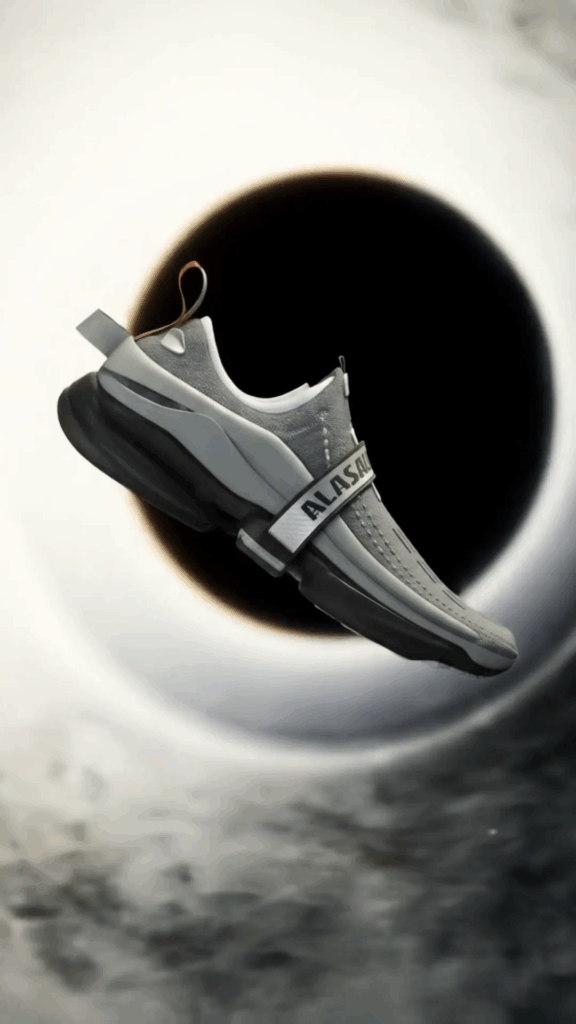
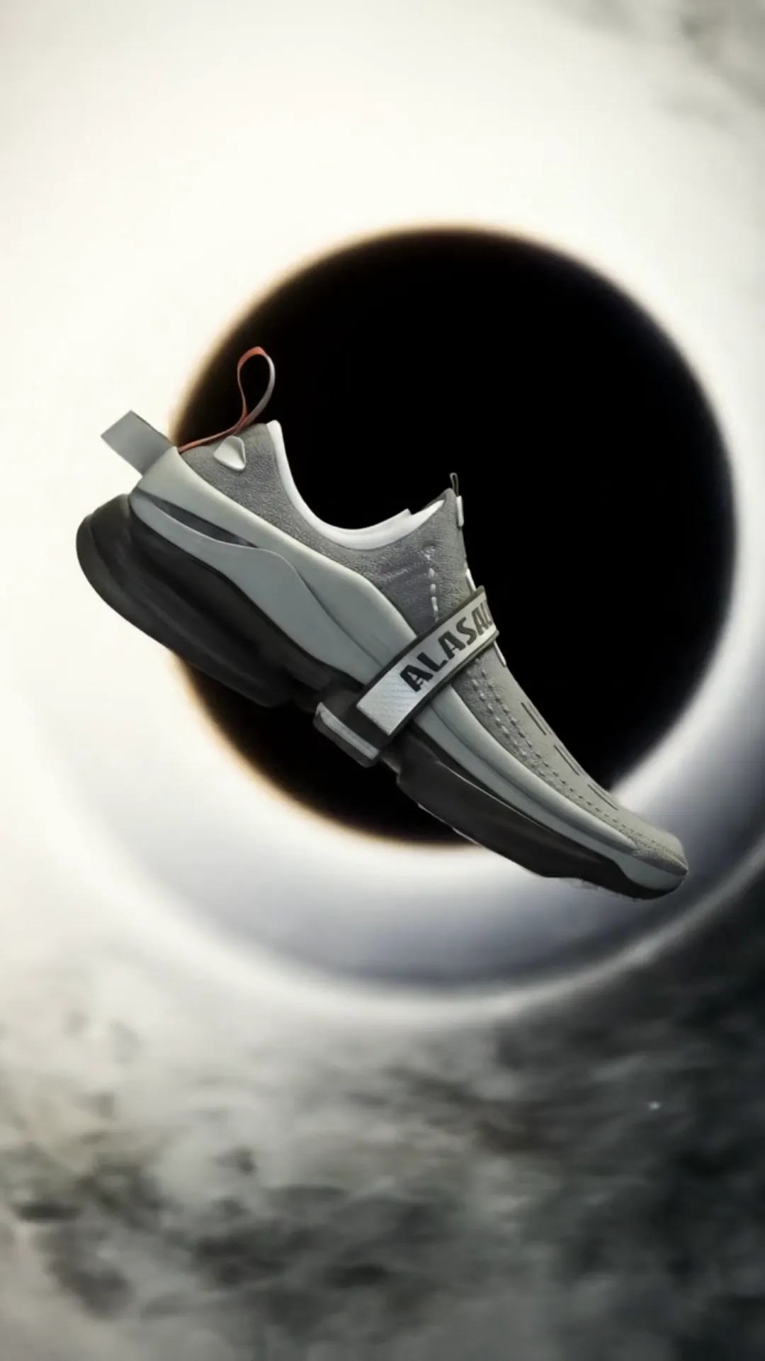
Once you’ve got your logo modeled, it probably looks like a plain grey shape. Not exactly ‘stunning’ yet, right? This is where materials and textures come in. This step is like choosing what your logo is *made* of in the virtual world. Is it shiny metal? Smooth plastic? Rough concrete? Gleaming glass? The material choice dramatically changes the personality and feel of your logo.
Think about the brand again. A luxury brand might use polished gold or brushed aluminum. An eco-friendly brand might use wood or stone textures. A tech company could go for sleek plastic or cool, matte surfaces. The material is a huge part of the visual communication. It tells a story about the brand through touch and feel, even when you can’t actually touch it. Selecting the right material properties – how reflective it is, how rough or smooth, what color it is – is key to making the 3D logo feel real and appropriate for the brand.
Materials aren’t just color. They have properties like ‘shininess’ (specularity), ‘reflectiveness’ (how much it mirrors its surroundings), ‘roughness’ (how spread out those reflections are), and ‘transparency’ (if you can see through it, like glass). Playing with these settings is where the magic happens. A slight change in roughness can make plastic look like polished marble or rough rubber. Adding reflectivity can make a surface look like polished chrome or a dusty old sign. It’s a subtle dance of sliders and values, but the visual difference is night and day.
Textures are like applying an image or pattern onto the surface of your 3D model. You could put a wood grain texture on your logo, or a carbon fiber pattern, or even just a subtle noise pattern to break up a perfectly smooth surface and make it look more realistic. Textures can add detail and visual interest that would be too complex to model geometry for. You can also use textures to control other properties of the material, not just color. For example, a ‘roughness map’ is a texture that tells the material which parts should be rough and which should be smooth, allowing for detailed surface variations like fingerprints on polished metal or scratches on painted wood. This level of detail is what separates a basic 3D logo from one that looks truly high-quality and believable. It’s about mimicking the imperfections and characteristics of real-world surfaces to fool the eye into thinking the digital object is real. Getting the right textures and materials is absolutely critical when you want to Create Stunning 3D Logos that feel grounded and authentic.
I remember struggling with a logo that needed to look like old, weathered metal. Just choosing a metallic color wasn’t enough. I had to find or create textures for rust, scratches, and pitting. Then, I had to tell the software how those textures should affect the reflectivity and color of the metal. It took a lot of experimentation, layering different textures, and adjusting their strength, but eventually, I got that gritty, aged look that told a story. It felt earned. That project taught me that materials aren’t just a coat of paint; they are deeply tied to the history and character you want the object to convey. They add a layer of narrative to the visual design. Without careful attention to materials and textures, even the best modeled and lit logo will fall flat, looking artificial and unconvincing. It’s the material properties that give the object its physical presence and how it interacts with light, which brings us to the next crucial step.
Choosing and creating materials is an art in itself. There are huge online libraries of materials and textures you can start with, or you can learn to create your own from scratch using specialized software or even photographs. Understanding how different material properties work together is key. A super reflective material on a rough surface won’t give you sharp mirror reflections; it will scatter the light, making the surface look dull or frosted. A transparent material needs thickness to look like glass or water. These are the nuances you learn through practice and observation. And just like modeling, iteration is part of the process. You’ll apply a material, see how it looks under your current lighting, and then tweak it. Maybe it’s too shiny, or not shiny enough, or the texture is too large or too small. You go back and adjust until it feels just right. This back and forth between applying materials and setting up lighting is essential for achieving a realistic or stylized look. It’s a dialogue between light and surface, and mastering this dialogue is fundamental to your ability to Create Stunning 3D Logos that truly capture the viewer’s attention and imagination.
Shining a Light: How Lighting Makes Your Logo Pop
You’ve modeled your logo, given it cool materials. Now, let there be light! Lighting in 3D is just as important as it is in photography or film. It’s what reveals the form, highlights the textures, and sets the mood. A brilliantly modeled and textured logo can look totally flat and boring with bad lighting. And conversely, good lighting can make even a simple model look amazing.
Think of light sources like virtual lamps or the sun. You can place them anywhere in your 3D scene. The position, color, brightness, and size of your lights all affect the final look. A single light source from the front might light everything evenly, but it can make the logo look flat – like a flash photo. Putting a light off to the side can create shadows and highlights that show off the logo’s depth and form. Lights from behind can create cool rim lighting that separates the logo from the background and gives it a glowing outline.
I often use a ‘three-point lighting’ setup as a starting point – it’s a classic in photography and 3D. You have a main ‘key’ light (the brightest one, often off to the side), a ‘fill’ light (softer, on the opposite side to reduce harsh shadows), and a ‘back’ or ‘rim’ light (from behind, to create highlights on the edges). This setup provides good definition and volume. But you don’t have to stick to rules! You can experiment with all sorts of lighting – colored lights, spot lights, area lights (like soft boxes), or environmental lighting that simulates being in a specific place, like a city street or a studio.
The type of shadows your lights create is also crucial. Do you want sharp, hard shadows (like a sunny day) or soft, diffused shadows (like an overcast day or indoor lighting)? This is usually controlled by the size of the light source. Smaller lights create sharper shadows; larger lights create softer ones. Shadows add depth and ground the logo in the scene. Without shadows, the logo can look like it’s just floating awkwardly. The quality of the shadows plays a huge role in making the 3D object feel like it belongs in a physical space and is being naturally lit. Harsh shadows can add drama, while soft shadows can make things feel more gentle or elegant. Getting the shadows right is a subtle but powerful way to influence the overall look and feel when you Create Stunning 3D Logos.
Consider the background your logo will be on. Will it be a solid color? An image? A gradient? Your lighting should work with the background. A logo with strong backlighting might disappear on a bright background but pop beautifully on a dark one. Environmental lighting, which uses a 360-degree image of a real-world location (like a photo of a room or an outdoor scene), can be particularly effective because it provides realistic lighting and reflections that match the environment. This is a great way to make your logo look like it’s actually sitting in a specific place, which can add a lot of credibility and visual interest.
I remember one project where the client wanted the logo to feel ‘heroic.’ My initial lighting was too soft. I switched to a single, strong, slightly low light source with sharp shadows, and suddenly, the logo felt powerful and monumental. It was amazing how just changing the lighting completely altered the emotional impact. This taught me that lighting isn’t just about seeing the logo; it’s about shaping how people *feel* about it. It’s a storytelling tool. It directs the viewer’s eye, highlights the important features, and can evoke specific emotions – drama, calm, excitement, sophistication. The lighting setup you choose is as much a design decision as the shape or the material. It’s an integral part of the process to Create Stunning 3D Logos.
Experimentation is key here, just like with materials. Set up a few lights, render a test image, and see how it looks. Move the lights, change their colors, adjust their intensity. See what happens. There are no strict rules, only principles based on how light works in the real world. Understanding those principles helps you make informed decisions, but ultimately, trust your eye. What looks good? What feels right for the brand? Don’t be afraid to spend a lot of time just playing with lights. It’s a rewarding part of the process, and getting it right makes all the difference in the final render. Perfecting the lighting setup is often the stage where a good 3D logo transforms into a truly stunning one, where it gains that extra dimension of realism or style that makes it unforgettable.
Rendering: Bringing It All to Life
You’ve got your modeled logo, beautiful materials applied, and the perfect lighting setup. Now comes the part where the computer crunches all that information and creates the final image or animation: rendering. This is basically the 3D software calculating how the light interacts with the materials on your model from a specific camera angle and generating a 2D image (or a sequence of images for animation).
Rendering can take time. How much time depends on the complexity of your scene (how many polygons are in your model, how detailed your materials are) and your lighting setup (realistic lighting with complex shadows and reflections takes longer) and, of course, how powerful your computer is. For a simple logo render, it might be seconds or minutes. For a super realistic animation with lots of detail, it could be hours or even days on a single computer! This is often the stage where patience is tested the most. You’ve done all the creative work, and now you just have to wait for the computer to do its thing.
There are different types of rendering engines, and they use different methods to calculate the light paths. Some are faster but might produce less realistic results; others are slower but can create incredibly lifelike images. The software you use will likely have one or more built-in rendering options, and you can also get external renderer plugins. Understanding the basic settings of your renderer is important – things like resolution (how big the final image is), sample count (how many light rays the computer calculates – more samples mean less ‘noise’ or graininess but take longer), and output format (like PNG, JPG, or TIFF). For a logo that needs a transparent background (so you can place it on any color or image), you’ll need to render in a format that supports transparency, like PNG or TIFF.
Before doing a final, high-quality render that might take a long time, you’ll usually do ‘preview’ renders or work in a real-time view that gives you a rough idea of what the final render will look like. This is essential for quickly checking your lighting, materials, and camera angle without waiting forever. You make adjustments based on the preview, then do another preview, and so on, until you’re happy. It’s an iterative process of tweaking and testing. I spend way more time doing low-quality previews than I do on the final render itself! It saves so much time and frustration. It’s like taking instant snapshots to check your work before doing the final photoshoot. This is especially true when you are trying to Create Stunning 3D Logos with complex lighting or materials; you need to see how every little change affects the final outcome.
The resolution you choose depends on where the logo will be used. For a website header, you might need a specific pixel size. For print, you’ll need a much higher resolution (measured in DPI – dots per inch) to ensure it looks sharp when printed large. Rendering at the correct resolution from the start saves you headaches later. Trying to make a low-resolution image look good when scaled up rarely works well. Plan for the highest likely resolution you’ll need and render at that size. You can always make it smaller later without losing quality. Planning the output is part of the process of learning to Create Stunning 3D Logos that are actually useful in the real world.
Sometimes you might render out different ‘passes’ alongside the main image. These are separate images that isolate specific information, like just the shadows, just the reflections, or just the color. This can be useful if you plan to do further editing in image software like Photoshop or After Effects. It gives you more control in post-production to fine-tune the final look. While not always necessary for a simple static logo, it’s a powerful technique to know if you want maximum flexibility. Rendering is the final technical hurdle, turning all your setup and design work into a finished visual product. It’s the moment of truth, where you see all your decisions about modeling, materials, and lighting come together. And while it requires patience, seeing that beautiful, finished 3D logo pop up on your screen after the render finishes is incredibly satisfying. It’s the culmination of all your efforts to Create Stunning 3D Logos, finally ready to be shown to the world.
Common Hiccups and How I Tackled Them
Learning to Create Stunning 3D Logos isn’t always smooth sailing. You hit snags. Things don’t look right. The software crashes. It happens to everyone, and it definitely happened to me, countless times! Part of becoming good at 3D is learning how to troubleshoot. Here are a few common problems I ran into and how I learned to deal with them.
“My logo looks flat, even though it’s 3D!” – This was a big one when I started. Usually, this comes down to lighting or materials. If your main light is coming straight from the camera, you won’t get shadows or highlights that show off the depth. Try moving your main light off to the side. Also, check your materials. If they have no specularity or roughness variation, they won’t react to light in an interesting way. Make sure your materials have some shine or texture that the light can interact with to reveal the form. 
“My render is grainy or noisy.” – This is super common, especially in areas with shadows or reflections. It’s usually because your render settings aren’t high enough, specifically the ‘sample count’ or similar quality settings related to how the renderer calculates light. More samples mean a cleaner image, but longer render times. You have to find a balance. Start with a lower setting for previews and crank it up for the final render. Sometimes, adjusting the lighting setup can also help reduce noise. Certain types of lights or materials are more prone to noise than others. Learning which settings in your specific software control noise is key. It took me a while to understand the relationship between sample count, render time, and image quality, but figuring that out saved me a lot of frustration and wasted rendering time. It’s a technical detail, but mastering it is part of the process of producing high-quality Create Stunning 3D Logos.
“Edges look weird or bumpy.” – This often goes back to the modeling. If your model isn’t clean, or you have overlapping geometry, or the edges weren’t beveled correctly, you can get strange artifacts when light hits them. Go back to the modeling stage and examine the problem area closely. Is the mesh smooth? Are there any holes or reversed faces? Sometimes re-doing the edge bevel or using a smooth modifier can fix this. It’s like finding a kink in a piece of wire – you have to go back and straighten it out before you can finish the project. Clean geometry is the foundation for smooth surfaces and crisp edges in your final render. This is a common issue when learning to Create Stunning 3D Logos – the technical details of modeling really matter.
“The colors in my render don’t match what I see in the software.” – Color management can be tricky in 3D. There are settings related to color profiles and how light interacts with color that can affect the final output. This can also be affected by the display you are viewing the render on. Ensure your software’s color management settings are set up correctly, often using standard profiles like sRGB. Also, remember that how a color looks in the software viewport might not be exactly how it looks in a final render, especially if you are using complex lighting and materials. Doing test renders is the best way to check your actual output colors. Sometimes, small adjustments to the material color are needed based on how the renderer interprets it under your specific lighting. It’s a bit of trial and error to get the colors spot on, especially if you are trying to match a very specific brand color. Understanding color spaces and how your software handles them is a more advanced topic, but it’s necessary if color accuracy is critical for your Create Stunning 3D Logos project.
“My render times are way too long.” – Besides sample count, other factors affect render time. Complex geometry, lots of lights (especially ones that cast complex shadows), highly reflective or transparent materials, and very high resolutions all increase render time. Check your scene for unnecessary complexity. Are there objects you can hide? Can you simplify any models? Are your materials overly complex for what you need? Lowering the output resolution for tests can speed things up significantly. Sometimes, upgrading your computer hardware (specifically the graphics card or processor) is the only way to get drastically faster render times, but optimize your scene first. Efficient scene setup is a skill that develops with experience and is key to delivering projects on time, especially when you are tasked to Create Stunning 3D Logos under deadlines.
“Client feedback is hard to implement in 3D.” – This is more of a process issue. Because 3D is a different workflow than 2D, changes might take longer. The best approach is to get feedback at different stages. Show the client the modeled shape before texturing. Show them different material options as simple renders. Show them lighting tests. This way, they can give feedback early in the process when changes are easier to make, rather than waiting until the final render is done and asking for a major change. Clear communication upfront about the process and stages helps manage expectations. Sometimes, a client might ask for something that is technically difficult or impossible to achieve in 3D while still looking good or being practical. Being able to explain *why* something won’t work or suggesting alternative solutions based on your understanding of 3D capabilities is important. It’s about being a good partner in the creative process, not just a button-pusher. Handling feedback effectively is crucial when you are collaborating to Create Stunning 3D Logos that meet someone else’s vision.
Dealing with these hiccups is just part of the journey. Each problem you solve teaches you something new about the software and the process. Don’t get discouraged when things don’t work right away. Look up tutorials, check forums, and just keep experimenting. Every expert started out as a beginner who ran into problems and figured them out. Troubleshooting builds your expertise and makes you more capable of tackling increasingly complex projects and truly learning to Create Stunning 3D Logos with confidence.
Making It Fit: Using Your Shiny New 3D Logo
Alright! You’ve gone through the whole process, tackled the hiccups, and successfully created a stunning 3D logo. Now what? You need to use it! Unlike a 2D logo which is usually a single file type like a PNG or SVG, your 3D creation is more like an object that needs to be viewed or placed somewhere.
Most often, you’ll use rendered images or animations of your 3D logo. The static images you render (like PNGs with transparency) are great for website headers, business cards (if high resolution), presentations, and social media posts. You can place these images over different backgrounds because you hopefully rendered them with transparency enabled. Just make sure you’ve rendered at the right size and quality for where it’s going to be used. A small web image won’t look good printed large on a banner, as we touched on before. Having different renders for different uses is a smart move. A high-resolution version for potential print use, a web-optimized version, maybe versions at different angles or with slightly different lighting to fit various contexts. This versatility in output options is one of the strengths of creating a 3D logo; you have control over how it’s presented from almost any viewpoint and under any virtual lighting condition. This adaptability makes your investment in learning to Create Stunning 3D Logos pay off across many different applications.
For video intros, commercials, or dynamic online content, you’ll use animations of your 3D logo. This is where the 3D really shines – you can make it spin, fly in, change material, or have light effects play across it. Creating animations involves setting up a timeline in your 3D software and defining how the logo or camera moves over time. Each frame of the animation is essentially a separate render. This is much more render-intensive than a single image, but the result can be incredibly impactful. A professionally animated 3D logo intro can make a brand feel incredibly dynamic and high-tech. Think about movie studio logos or major tech companies – their animated 3D logos are instantly recognizable and add to their brand’s prestige. Learning the basics of animation – keyframes, timing, easing – opens up a whole new dimension of how you can use your 3D creation to engage an audience. It adds motion and time to the form and material you’ve already perfected, bringing the logo to life in a compelling narrative way.
Sometimes, you might even use the 3D model itself, not just a rendered image. This is less common for standard logo use but happens in things like augmented reality (AR) apps or interactive 3D experiences on a website. In these cases, the user might be able to rotate the logo or see it placed in a real-world environment through their phone camera. This requires optimizing your 3D model to be lightweight enough for real-time rendering on different devices and exporting it in specific formats (like GLTF or USDZ). This is a more advanced application, but it shows the potential future uses of 3D logo assets. The core skill of creating the 3D model is the foundation for all these possibilities.
Remember that while your 3D logo is fantastic, you’ll likely still need a flat, 2D version of the logo too. Why? Because 3D isn’t always practical or necessary. You can’t embroider a detailed 3D logo onto a shirt easily, print it in a single color for a fax header (does anyone still fax?), or use it as a tiny favicon in a browser tab. A good brand identity system includes variations of the logo for different uses – the full-color 3D version, a flat color version, a single-color version, perhaps a simplified version for small sizes. The 3D version becomes one powerful tool in the brand’s visual toolbox, used strategically where it will have the most impact. It doesn’t replace the 2D logo entirely but complements it, adding depth and versatility to the brand’s visual presence. Understanding when and where to use the 3D version is just as important as creating it. It’s about using the right tool for the job to ensure the brand looks its best in every situation. Learning to effectively deploy your Create Stunning 3D Logos across various platforms and formats is the final step in making your hard work pay off and ensuring the logo serves its purpose effectively.
Staying Fresh: Trends and What’s Next for 3D Logos
Like all design fields, 3D logo design evolves. What looks stunning today might look dated in a few years if you’re not careful. Keeping an eye on trends doesn’t mean blindly following them, but understanding what looks modern and fresh can help your Create Stunning 3D Logos projects have longevity.
Right now, I see a move towards cleaner, more subtle 3D. Less of the overly glossy, bubbly look that was popular years ago. More focus on realistic materials, sophisticated lighting, and subtle depth rather than exaggerated cartoonish effects. Think elegant metallic finishes, matte surfaces that react beautifully to light, realistic glass or liquid effects where appropriate, and lighting that feels natural, like the logo is truly sitting in a believable space. The trend is towards realism or hyper-realism, even for abstract shapes. It’s about making the object feel solid and grounded.
Also, integration is key. The best 3D logos aren’t just floating shapes; they feel like they belong in their environment. This is where environmental lighting and considering the background during the design process become super important. Creating logos that look good rendered from multiple angles is also becoming more common, as brands use 3D assets in more varied ways online and in video. This means designing the logo not just for one perfect ‘hero’ shot, but ensuring it looks good from the top, the side, at an angle, etc. This requires a more robust approach to the modeling stage, making sure the form holds up from all viewpoints. It forces you to think of the logo truly as an object, not just a fancy image. This holistic approach to designing a 3D form is essential for creating truly versatile and stunning 3D logos that will serve the brand well across different media.
Animation trends are also moving towards sophistication. Subtle movements, realistic physics (if objects interact), and seamless transitions are more valued than flashy, over-the-top effects. Think elegant reveals, gentle rotations, or materials that subtly change properties. As rendering technology gets faster, more complex and higher-quality animations are becoming feasible even for smaller businesses. We are seeing more detailed camera moves, more complex interactions between logo elements, and more realistic material responses in animated intros. The quality bar for animated 3D logos is rising, pushing designers to refine their skills in timing, easing, and simulated physics to make animations feel natural and engaging. This continuous evolution in both static renders and animations means that learning to Create Stunning 3D Logos is a journey of continuous learning and skill refinement.
Looking ahead, I think we’ll see more integration with real-time 3D environments, as mentioned earlier. As AR and VR become more common, brands will want their logos to exist as interactive 3D objects that users can encounter in those spaces. This will require designers to not only create high-quality 3D models but also understand the technical constraints and requirements of real-time rendering engines used in games and interactive applications. The skills needed to Create Stunning 3D Logos for a pre-rendered animation are different from the skills needed to create a 3D asset that can be dropped into an AR scene on a phone and look good from any angle in real-time. This future direction points towards the increasing value of a solid foundation in 3D modeling and optimization, alongside artistic skills in texturing and lighting.
Staying fresh means staying curious. Keep learning new software features, experiment with new techniques, and pay attention to what other designers are creating. Look at the trends not just in logos, but in 3D art, animation, and even real-world design and architecture. Inspiration can come from anywhere. The ability to Create Stunning 3D Logos is a moving target, constantly evolving with technology and design tastes. Embrace the learning process, stay experimental, and keep pushing the boundaries of what you can create in three dimensions. This forward-thinking approach ensures that your skills remain relevant and that you can continue to produce work that is not only stunning but also modern and effective for your clients or your own brand.
My Journey with Create Stunning 3D Logos
I didn’t start out planning to make 3D logos. Like many designers, I began with flat graphics – posters, brochures, simple logos. But I was always drawn to visuals that had depth and texture, things that felt tactile. I remember spending hours just looking at product packaging, noticing how light hit different materials and how shapes curved in space. This fascination eventually led me to explore 3D software, initially just out of curiosity.
My first attempts at 3D were… rough. I tried to model simple objects and they looked clunky and amateurish. The software felt like navigating a spaceship – confusing menus, weird controls. It was frustrating. But I stuck with it, mostly because the *idea* of creating something with form and volume was so compelling. I started with basic tutorials – how to move around in 3D space, how to create simple shapes, how to add a basic light. Slowly, painfully, I started to get the hang of it.
One of my early personal projects was trying to recreate my own simple 2D logo in 3D. It was just a few letters. I spent ages trying to extrude them cleanly, bevel the edges nicely, and make the material look like brushed metal. It took way longer than I expected. The first renders were terrible – weird shadows, patchy reflections, bumpy edges. But with each attempt, I learned something new. I learned how subtle changes in the bevel angle made a huge difference. I learned that the color of the light affected the metal’s look. I learned that moving the light just a little bit could completely change the mood. This project, though small, was my real training ground for learning how to Create Stunning 3D Logos.
Slowly, I started offering 3D logo options to clients. My first few were simple – just extruded text or basic shapes with metallic or glossy materials. But as I gained more experience, clients started asking for more complex things. A logo that looked like it was carved from ice. A logo that was liquid metal. A logo that was made of intertwined glass elements. These projects pushed me to learn new techniques – advanced modeling, complex material setups, sophisticated lighting rigs, and even basic animation. Each challenging project was a chance to grow and add another tool to my toolkit for creating stunning 3D logos.
There were late nights rendering, crashes that lost hours of work, and moments where I felt completely stuck. But there were also moments of pure joy – like when a complex material finally looked realistic, or when a lighting setup perfectly highlighted the logo’s form, or most importantly, when a client saw the final render and was absolutely thrilled. Those moments made all the frustration worthwhile. Seeing a brand come to life in three dimensions, looking solid, impactful, and unique, is incredibly rewarding.
My journey with Create Stunning 3D Logos has taught me that it’s a blend of technical skill and artistic vision. You need to understand the software and the principles of 3D (modeling, materials, lighting), but you also need a strong design sense, an eye for detail, and the patience to iterate until it’s perfect. It’s a field that requires continuous learning, as software updates and technology advances. But for me, the process of transforming a flat concept into something that feels tangible and alive is endlessly fascinating. It’s about bringing another layer of reality and impact to visual communication, and I’m excited to see where this journey continues to lead. It’s not just a job; it’s a passion for making things pop off the screen and leave a lasting impression. That desire to make something truly stand out is what drives the effort to Create Stunning 3D Logos every single time.
Real-ish World Examples: Creating 3D Logos for Different Vibes
Let’s talk about how the principles we’ve discussed – modeling, materials, and lighting – come together for different types of brands. It helps illustrate how the ‘stunning’ part of Create Stunning 3D Logos is tailored to who the brand is.
Case Study 1: A High-Tech Security Company
Their 2D logo was sharp, angular, maybe with a shield or a stylized lettermark. For their 3D logo, the goal is to convey strength, reliability, and modernity. We’re talking sleek.
Modeling: The forms need to be precise and clean. Edges should be sharp, maybe with a very subtle, crisp bevel that catches light. If there are overlapping elements, they should interlock perfectly, suggesting security and integration. No soft curves or bubbly shapes here.
Materials: Metallic finishes are a strong choice. Brushed aluminum for sophistication, maybe dark chrome for seriousness. High reflectivity can work, but balanced with roughness so it doesn’t look cheap or overly flashy. Think about the materials used in high-end electronics or secure vaults. The texture of the material should feel smooth and resistant, not porous or fragile. A subtle anisotropic texture (like on brushed metal, where reflections appear as streaks) can add a layer of technical detail. The color palette would likely stick to cool tones – blues, greys, silvers, maybe deep blacks.
Lighting: Clean, perhaps slightly dramatic lighting. Edge lighting can highlight the sharp angles and create a sense of definition. Using area lights can give soft, modern reflections. Shadows should be relatively crisp to match the precise forms. A key light from the side can reveal the logo’s form, with fill light to ensure legibility, and maybe a cool blue or white rim light to add a futuristic touch and separate it from a dark background. The lighting should feel intentional and controlled, like a well-guarded system. It shouldn’t be overly diffuse or chaotic.
The overall vibe for Create Stunning 3D Logos for this brand is precision, strength, and forward-thinking security. Every choice reinforces that message.
Case Study 2: A Cozy, Artisan Bakery
Their 2D logo might be softer, perhaps handwritten text, maybe an illustration of wheat or a pastry. The 3D logo needs to feel warm, inviting, and authentic. Less polish, more charm.
Modeling: Forms could be softer, maybe thicker with gently rounded edges, suggesting dough or baked goods. If there’s a character or illustration, it should feel solid and perhaps slightly stylized, not overly realistic to the point of losing its charm. Text elements might have a subtle, soft depth rather than sharp extrusion. You might even consider subtle imperfections in the modeling to suggest handmade quality.
Materials: Matte or slightly textured materials work well. Baked clay, wood, paper texture, or even materials that subtly mimic bread crust or frosting. Reflectivity would be very low. Colors should be warm and earthy – browns, creams, soft yellows, maybe pops of red or berry colors depending on the brand. The material should feel pleasant and perhaps slightly soft to the touch, inviting and natural. Textures could include subtle noise or grain to avoid perfectly smooth surfaces, adding to the artisan feel. Maybe a material that looks like slightly porous ceramic or a gently worn wooden sign. These material choices are crucial to make the Create Stunning 3D Logos feel aligned with the brand’s values of warmth and craft.
Lighting: Soft, warm, and inviting lighting. Think of sunlight streaming into a bakery or the warm glow of ovens. Diffuse lighting from large sources would create soft shadows. Maybe a warm key light and a softer, neutral fill. Environmental lighting simulating a cozy kitchen or a sunny window could add realism and warmth through reflections and overall scene illumination. Avoid harsh spotlights or strong contrasts. The lighting should feel natural and comforting.
For this bakery, Create Stunning 3D Logos means creating something that feels edible, friendly, and grounded in tradition and quality. The 3D elements enhance that feeling of warmth and authenticity.
Case Study 3: A Dynamic E-sports Team
Their 2D logo is probably bold, maybe aggressive, using strong shapes and vibrant colors. The 3D logo needs to convey energy, speed, and competitive spirit.
Modeling: Sharp angles, dynamic curves, maybe interconnected or layered elements suggesting speed and strategy. Forms should feel strong and impactful. You might use bevels that create sharp highlights to emphasize speed and edge. The shapes should look good from multiple angles for potential use in animations or virtual environments.
Materials: High-tech, perhaps futuristic materials. Glossy plastics, polished metals, materials with emissive (glowing) elements, or perhaps a material that looks like carbon fiber or reinforced plating. High reflectivity and specularity can work well to catch light and add energy. Using bold, contrasting colors is key, reflecting the team’s branding. Materials might have patterns or textures that suggest digital circuitry or energetic fields. The goal is a look that feels powerful, fast, and visually striking, something that would look good on screen or in a game environment. Materials that react intensely to light can enhance the dynamic feel. Perhaps a material that shifts color slightly depending on the angle, or one with a subtle animated texture. These kind of dynamic material properties are becoming more common in 3D design and can really make a logo pop, especially for a brand tied to digital experiences like e-sports. They help Create Stunning 3D Logos that feel truly cutting-edge.
Lighting: Dynamic and dramatic lighting. Strong spotlights, colored lights that match the team’s colors, maybe volumetric lighting effects (light rays visible in the air) to add atmosphere. High contrast between light and shadow can add intensity. Rim lighting is great for making the logo stand out from a dark background, common in gaming visuals. Animation would likely involve fast camera moves and energetic logo reveals. The lighting should feel exciting and high-energy, matching the competitive nature of e-sports. Think stage lighting or the lighting inside a gaming arena. Sharp, focused lights highlighting specific parts of the logo can draw the eye and create a sense of speed and aggression. Using vibrant colored lights can reinforce the team’s visual identity and add to the overall high-octane feel. It’s about creating a visual punch that excites the audience and makes the logo feel powerful and memorable in a competitive visual landscape.
In each case, the process of Create Stunning 3D Logos involves making deliberate choices about form, surface, and light that are driven by the specific identity and goals of the brand. It’s not a one-size-fits-all process; it’s about using the tools of 3D to tell the brand’s unique story in a visually compelling way.
Beyond the Software: The Art and Craft of 3D Logo Design
While we talk a lot about software and technical steps – modeling, materials, lighting, rendering – it’s crucial to remember that Create Stunning 3D Logos is fundamentally an artistic process. The software is just a tool, like a brush or a chisel. Your eye, your creativity, and your understanding of design principles are what truly make a logo stunning.
It starts with that strong concept, as we discussed. But then, throughout the technical steps, you’re constantly making artistic decisions. What exact shade of metal feels right? How round should that edge be to feel elegant vs. clunky? Does the shadow fall in a way that makes the shape look powerful or weak? These aren’t decisions the software makes for you; they are choices you make based on your design sensibility and your understanding of the brand.
Developing that design sense in 3D means looking at the world around you with a critical eye. Notice how light reflects off different surfaces. Observe how shadows are cast. Pay attention to the textures of objects. How does a rough surface diffuse light differently than a smooth one? How does a translucent material look different from a transparent one? These observations inform your choices in the 3D software, helping you replicate or stylize reality effectively. The more you train your eye to see these details in the real world, the better you’ll be at recreating or interpreting them in 3D to Create Stunning 3D Logos.
Composition is still king, even in 3D. How is the logo framed by the camera? What angle is most flattering and informative? Where is the logo placed within the final image? All the rules of good visual composition – the rule of thirds, leading lines, negative space – still apply. Even for a simple static render of a logo centered on a page, the camera angle and distance make a difference. For more complex scenes or animations, composition becomes even more critical in guiding the viewer’s eye and making the image or animation visually appealing. It’s not just about putting the logo in the middle; it’s about presenting it in a way that feels balanced, dynamic, and highlights its best features. A great 3D logo render is like a great photograph – it’s not just the subject, but how it’s captured that makes it compelling. Learning to compose effectively in 3D space is a skill that takes time and practice, but it’s essential for presenting your Create Stunning 3D Logos in the best possible light (literally!).
The iteration process itself is part of the craft. Rare is the logo that looks perfect on the first try. You model, you apply a material, you add light, you render – and you see something you need to fix. You tweak, you re-render, you tweak again. This back-and-forth, this willingness to refine and improve, is fundamental to achieving a high-quality result. It requires patience and attention to detail. It’s easy to stop when it looks “good enough,” but pushing that little bit further often makes the difference between “good” and “stunning.” That commitment to refinement is a hallmark of skilled craftsmanship in any medium, and it’s particularly true in 3D design where there are so many interconnected variables – a change in lighting might require a tweak in the material, which might highlight an issue in the modeling. It’s a constant process of balancing and adjusting. This meticulous attention to detail and willingness to iterate distinguishes a standard 3D logo from one that truly stands out and embodies the goal to Create Stunning 3D Logos.
Finally, trust your intuition. While learning the technical aspects is important, sometimes a decision feels right even if you can’t articulate exactly why in technical terms. That’s your artistic sense at work, developed through observation and practice. Don’t be afraid to experiment and try unconventional approaches to materials, lighting, or modeling if it feels right for the brand and the concept. That willingness to explore and push boundaries is where truly unique and stunning designs come from. The blend of technical knowledge, artistic skill, keen observation, and patient iteration is the true craft behind creating compelling 3D logos that make a mark. It’s a challenging but incredibly rewarding pursuit.
Practice Makes Perfect (And Permanent! Sort Of.)
Getting good at creating 3D logos isn’t something that happens overnight. It takes practice. Lots of it. My early work looks almost comical to me now, but those hours spent fumbling through software and making mistakes were essential steps in the learning process. Every failed render, every weirdly shaded model, every frustrating bug was a lesson disguised as a setback.
Start small. Don’t try to create a hyper-realistic chrome eagle logo with intricate details and complex animation on your first go. Pick a simple shape, like a cube or a sphere, and practice basic modeling – extruding faces, beveling edges. Then practice applying different materials – make it look like plastic, then metal, then glass. See how the settings affect the look. Then practice lighting – set up a three-point light system, move the lights around, change their colors. Render often, even simple test renders, to see the results of your changes. Focus on mastering one skill at a time before trying to combine them all. This focused practice builds a solid foundation and makes the overall process feel less overwhelming. It allows you to get comfortable with the core tools and concepts before attempting more ambitious projects. Breaking down the complex goal of learning to Create Stunning 3D Logos into smaller, achievable steps is key to maintaining motivation and making steady progress.
Work on personal projects. Pick logos you like and try to recreate them in 3D, analyzing how they might have been made. Or take your own 2D designs and try to give them a 3D treatment. These personal projects allow you to experiment freely without client constraints and explore techniques just for the sake of learning. They are invaluable for building your skills and developing your own style. Don’t be afraid to try weird things – sometimes the most interesting discoveries come from unexpected experiments. Maybe try making a logo look like it’s made of jelly, just to see how you would model and texture that. These kinds of playful exercises push your understanding of the software and materials in unexpected ways and can lead to creative solutions for future client work. They are part of the journey to mastery, helping you develop the intuitive understanding needed to truly Create Stunning 3D Logos.
There are tons of resources out there to help you learn. Online tutorials, forums, communities of 3D artists. When I got stuck on a specific problem – like how to make a certain type of reflection look right or how to model a tricky curve – I would search for tutorials. Chances are, someone else has faced the same challenge and shared a solution. Learning from others is a huge part of the process. Don’t feel like you have to figure everything out on your own. Engage with online communities, ask questions (politely!), and share your work to get feedback. Constructive criticism can be incredibly helpful in identifying areas for improvement you might not see yourself. Being part of a community also keeps you motivated and exposed to new ideas and techniques, which is vital in a fast-moving field like 3D design. It reinforces the idea that Create Stunning 3D Logos is a skill built through shared knowledge and continuous practice.
And finally, be patient and persistent. Some days things will click, and you’ll feel like a 3D wizard. Other days, nothing will look right, and you’ll want to pull your hair out. That’s normal. Every artist and designer goes through that. Take a break, come back with fresh eyes, and keep going. The progress might feel slow at times, but as long as you keep practicing and keep learning, you *will* improve. The ability to Create Stunning 3D Logos is a skill that is honed over time, through dedication and perseverance. Celebrate the small wins, learn from the setbacks, and enjoy the process of bringing your creative visions to life in three dimensions. The journey of practice is where the real magic happens, transforming effort into expertise and allowing you to consistently produce high-quality work.
The ‘Feel’ Factor: What Makes a 3D Logo Truly Stunning?
We’ve talked about the technical stuff – modeling, materials, lighting, rendering. But what makes a 3D logo go from just technically correct to truly ‘stunning’? It’s something less tangible, something about how it makes you *feel*. It’s about the emotion, the story, the impact it has on the viewer.
A stunning 3D logo feels intentional. Every curve, every highlight, every texture seems like it was placed there for a reason. It communicates the brand’s personality instantly and powerfully. It doesn’t just sit there; it has presence. It demands attention in a good way. It feels solid, real, and important. It has a quality that makes you want to look at it longer, to examine the details, to see how the light plays off its surfaces. This perceived quality reflects back on the brand, making the brand feel high-quality and trustworthy. It’s that feeling of craftsmanship and attention to detail that elevates a design. It shows that the brand cares about its image and, by extension, cares about its customers and products. This perceived care translates into trust and confidence in the brand.
It tells a story. Is it a story of innovation and technology, suggested by sleek lines and metallic surfaces? Is it a story of tradition and craftsmanship, hinted at by warm textures and soft light? Is it a story of excitement and energy, conveyed through dynamic shapes and vibrant colors? The best 3D logos visually narrate the brand’s essence without needing a single word. They evoke the right feelings and associations subconsciously in the viewer’s mind. This narrative quality is what makes the logo more than just a pretty picture; it makes it a powerful piece of communication. When you Create Stunning 3D Logos, you are not just designing an object; you are crafting a visual narrative that captures the soul of the brand and presents it in a compelling, three-dimensional form that resonates deeply with the audience.
A truly stunning 3D logo is also memorable. Because it has that extra dimension, that sense of physical presence, it can stick in people’s minds more easily than a flat design. It has a tactile quality that lingers even after you’ve looked away. It occupies a space in your memory more like a physical object would. This memorability is invaluable for brand recognition and recall. In a world flooded with visual information, anything that helps a brand stand out and be remembered is a massive advantage. A distinctive, high-quality 3D logo cuts through the noise and leaves a lasting impression, ensuring that the brand stays top-of-mind for its target audience. This lasting impact is the ultimate goal when you set out to Create Stunning 3D Logos.
And ultimately, it evokes emotion. Whether it’s excitement, trust, comfort, or curiosity, a stunning 3D logo makes you *feel* something. That emotional connection is the deepest level of communication in design. It’s what makes people connect with a brand on a gut level. Achieving this level of emotional resonance through a combination of form, material, and light is the art at the heart of 3D logo design. It’s about understanding not just how shapes look, but how they make us feel. It’s a culmination of all the technical steps and artistic choices, working together harmoniously to create something that is not just seen, but felt. That’s what makes Create Stunning 3D Logos such a powerful and rewarding pursuit – the ability to craft visuals that don’t just represent a brand, but truly embody its spirit and connect with people on an emotional level, leaving an indelible mark.
Conclusion
So there you have it – my journey and thoughts on how to Create Stunning 3D Logos. It’s a process that blends technical skill with artistic vision, requiring patience, practice, and a keen eye for detail. From the initial concept and brainstorming, through the steps of modeling, applying materials, setting up lighting, and finally rendering, each stage builds upon the last to bring a flat design into the physical-feeling world of three dimensions. We’ve touched on why 3D logos matter, the tools you need, how to tackle common problems, and how to use your finished creations. We’ve also explored how different design choices serve different brands and what makes a 3D logo truly resonate emotionally and artistically.
Creating 3D logos is a challenging but incredibly rewarding field. It pushes you to think about design in new ways and offers powerful tools to make a brand truly stand out. Whether you’re just starting out or looking to refine your skills, remember to focus on the fundamentals, practice consistently, and always strive to tell the brand’s story through your design choices. The effort to Create Stunning 3D Logos is an investment that pays off in creating powerful, memorable brand identities that capture attention and leave a lasting impression.
If you’re interested in diving deeper or need help bringing your brand to life in 3D, check out these resources:
www.Alasali3D.com
www.Alasali3D/Create Stunning 3D Logos.com
Happy designing, and go Create Stunning 3D Logos that pop!