The Art of VFX Typography isn’t just about picking a cool font and slamming it onto a video. Nope, it’s way more involved, way more creative, and honestly, way more fun than just typing. Think about it: when you see text pop up in a movie or a show – whether it’s a title card, a location marker, a piece of futuristic interface glowing on a screen, or even text dissolving into dust – that text isn’t static. It moves, it changes, it interacts with the world around it. It’s part of the visual effect itself. For someone who’s spent years playing around in this space, making letters bend, twist, explode, or shimmer into existence, I can tell you it’s a niche within VFX that has its own set of rules, its own challenges, and a massive impact on how a story feels. It’s where graphic design meets motion, where readability battles against spectacle, and where every letter needs to earn its place on screen. Getting the chance to work on projects where text is more than just information – where it’s a character, a plot device, or a visual signature – that’s where The Art of VFX Typography truly shines.
What Exactly is The Art of VFX Typography?
So, let’s break it down. At its core, The Art of VFX Typography is about integrating text elements into live-action footage or animated sequences in a way that feels seamless, dynamic, and intentional. It’s not just motion graphics, though there’s definitely overlap. Motion graphics often live in their own designed space, like explainer videos or broadcast idents. VFX typography, on the other hand, is about placing text *within* the world of the film or show. It’s that building name that appears and tracks perfectly with the camera movement. It’s the message that appears on a character’s cracked phone screen, reflecting the light realistically. It’s the ancient inscription that glows with magical energy. It’s about making text feel like it belongs, like it was always part of that scene, or like it’s actively affecting the environment.
It involves understanding things like perspective, lighting, motion blur, depth of field, and how elements interact. You might have text that needs to appear behind an actor as they walk past, or text that needs to cast shadows on the set. It’s about getting technical with tracking points and mattes, but it’s also deeply creative, deciding how that text should look, behave, and transform to serve the story. It’s a constant balance between technical skill and artistic vision. When it’s done well, you might not even consciously notice it, but if it’s done poorly, it can instantly pull you out of the illusion. That’s the subtle power of The Art of VFX Typography.
Learn more about examples of VFX Typography
Why Does Text Matter So Much in Visual Effects?
Okay, maybe you’re thinking, “It’s just text, right? People read it and move on.” But oh man, it’s so much more than that in a visual context. Text is potent. It carries direct information, obviously, but its *visual presentation* carries immense subtext and mood. The font you choose, how it moves, how it integrates – or fails to integrate – speaks volumes.
Think about movie titles. A horror film title card might be jagged, hand-scrawled, perhaps dripping or scratched. A sci-fi epic might use sleek, futuristic sans-serif fonts that glow or assemble themselves with precision. A historical drama’s titles might look etched into stone or written on aged parchment. This isn’t just aesthetic choice; it’s setting the tone *before* the movie even really starts. The *way* text appears is part of the storytelling. Does it slam onto the screen aggressively? Does it gently fade in? Does it glitch and distort? All these decisions affect the viewer’s feeling and understanding of the world you’re showing them.
In actual scenes, dynamic text helps ground the narrative. A location title helps you instantly orient yourself. Text on a screen or interface shows you what a character is doing or seeing. But if that text just floats unnaturally or doesn’t react to the camera or the environment, it feels fake. Good VFX typography adds layers of credibility and immersion. It guides the viewer’s eye and provides information within the visual flow, rather than interrupting it. It’s about making information delivery visually compelling and integrated into the narrative fabric. It’s truly part of the visual language of film and TV.
The Journey: From Concept to Final Frame
Alright, so how does this stuff actually happen? It’s usually not just one person clicking a button. It’s a pipeline, a journey from idea to finished product. And in The Art of VFX Typography, that journey has specific steps.
It usually starts with the script or a concept art piece. The director or client knows they need text for something – maybe a sign needs to appear damaged, or a holographic display needs to show complex data. The first step is figuring out the *what* and the *why*. What does the text say? What’s its purpose in the scene? What’s the desired mood or feeling? What era or style does it belong to? This leads to the design phase. This is where fonts are chosen, colors are picked, and the general look is established. Sometimes this is done by a graphic designer, sometimes by the VFX artist themselves, depending on the project. You might go through several iterations here, showing mockups of how the text will look.
Once the design is approved, you move into asset creation and preparation. If it’s 3D text, you model it. If it’s 2D, you create the graphic elements. Then comes the crucial step of integrating it into the footage. This often involves tracking. You need to tell your software how the camera moved in the original shot so your text can follow along perfectly. This might be 2D tracking for simple movements or full 3D camera tracking for complex shots where the text needs to live in 3D space.
Next is the animation. How does the text appear? How does it disappear? Does it move, rotate, scale? Does it do something fancy like explode or melt? This is where the life is breathed into the text. You might animate its position, rotation, scale, opacity, color, or even its shape or structure. This is where you really apply principles of animation to make the text feel dynamic and purposeful.
After animation, especially for 3D text, you get into lighting and rendering. You need to light the 3D text so it matches the lighting of the live-action plate. Does it have reflections? Does it cast shadows? What about motion blur from fast movement? All these details are handled during rendering. For 2D text or simpler effects, some of this might happen directly in the compositing stage.
Which brings us to compositing. This is where everything comes together. The rendered text elements (or the 2D graphics) are brought into the compositing software along with the original live-action footage. This is where you blend it all together. You adjust colors, add glows, reflections, lens flares, dust, scratches – whatever is needed to make the text look like it’s truly part of the scene, not just stuck on top. This is where you might use mattes to place text behind objects or characters, add subtle environmental effects, or refine the motion blur and depth of field to match the plate. This stage requires a keen eye for detail and realism.
Finally, there’s review and refinement. The shot is shown to the supervisor, director, or client, and feedback is given. You make adjustments, render again, and repeat until it’s perfect. It sounds straightforward when you list the steps, but each one can present its own set of challenges, and often you’re jumping back and forth between stages.
The Tools of the Trade (Without Getting Too Jargon-y)
Okay, we use software, obviously. But it’s less about knowing *every* button and more about understanding the *type* of tool for the job. For creating the text and maybe animating it in 2D space, something like Adobe After Effects is a common go-to. It’s fantastic for motion graphics and getting text to move in cool ways, and you can do a lot of compositing there too.
When you need text to live in 3D space – like tracking onto a wall, exploding realistically, or having complex lighting and reflections – you step into the world of 3D software. Programs like Maya, 3ds Max, Cinema 4D, or Blender are powerful for modeling 3D text, setting up lighting that matches your scene, animating it in 3D space, and rendering it out. Sometimes the animation and effects like destruction or fluid simulation (if your text is melting or breaking apart) happen here.
For the final integration, the compositing, professional VFX houses often use software like Nuke or Foundry’s Nuke. These are super powerful for layering elements, color correction, keying green screens, and making sure everything looks cohesive. After Effects can do compositing too, but Nuke is built from the ground up for complex VFX workflows, especially integrating CG elements like 3D text into live-action.
Beyond the main software, there are plugins and scripts that can help with specific tasks, like advanced tracking, simulating certain effects, or speeding up repetitive processes. But honestly, the specific software is less important than understanding the *principles* of The Art of VFX Typography – how text should look, move, and interact to tell the story effectively within the visual context.
Check out a popular tool for motion graphics and VFX
Making Text “Feel” Right: Matching Style to Story
This is where The Art of VFX Typography really comes into its own. It’s not just about making text look cool; it’s about making it look *appropriate*. The right font and animation style can instantly convey genre, era, and mood. Get it wrong, and it’s jarring.
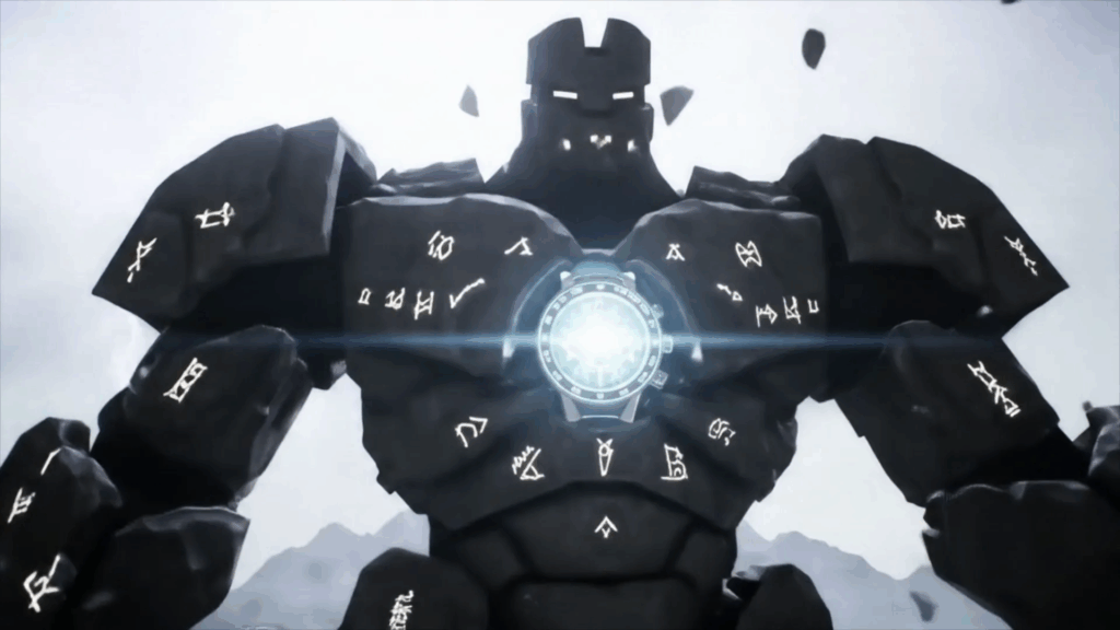
Imagine a fantasy film. The text for ancient runes glowing on a stone wall should probably look rough, maybe inscribed, with a mystical glow that flickers realistically. You wouldn’t use a clean, modern sans-serif font here, right? And the glow shouldn’t be a perfectly smooth animation; it should pulse, maybe react to ambient light or magic in the scene. The texture of the text might look like it was carved or burned into the stone. The edges might be rough, uneven. The light it emits might interact with dust motes in the air or cast subtle shadows on the surrounding rock. This attention to detail in matching the text’s visual properties – its font, texture, color, and illumination – to the world it inhabits is absolutely key. It’s about designing the text as an artifact of that world.
Now think about a slick corporate thriller. Text appearing on computer screens or holographic displays needs to look sharp, maybe minimalist. Often, monospace fonts or clean, geometric sans-serifs are used. The animation might be precise, assembling letter by letter or line by line with crisp transitions. It might have subtle lens distortion as the camera moves past the display, or reflections from the environment. The glow might be controlled and uniform, perhaps with subtle scan lines or digital artifacts if that’s the desired look. The text itself might update in real-time, simulating data streams or terminal outputs. Every element, from the typeface to the refresh rate of the simulated display, contributes to the feeling of technology and information flow. It’s a completely different vibe from the fantasy runes.
Or consider a gritty, hand-held documentary style. Text for lower thirds (that strip at the bottom with someone’s name) might be simple, perhaps even slightly shaky to match the camera movement, with a clean, readable font that doesn’t draw too much attention but still looks professional enough. The timing of when it appears and disappears is also crucial here – it needs to be on screen long enough to read but not overstay its welcome. It’s about being informative without being flashy.
These aren’t just random choices. They come from understanding the narrative, the visual style of the project, and the emotional impact you want the text to have. The Art of VFX Typography is about making these deliberate choices and then executing them technically so they feel like a natural part of the finished shot.
Find inspiration for typefaces
Bringing Text to Life: The Magic of Animation
Making text move is where things get really fun. Basic stuff is easy – fade in, slide on, maybe a little bounce. But VFX typography often pushes way beyond that. We’re talking about animation that tells its own mini-story.
Imagine text appearing not just by fading, but by growing like vines, or being painted on by an invisible hand, or shattering into pieces and reassembling. This requires thinking about the animation curve – not just the start and end points, but the speed and timing in between. Is the movement quick and sharp? Slow and deliberate? Does it accelerate or decelerate? These subtleties add a lot of character.
Beyond simple transformations, there are complex effects. Text might dissolve into smoke, disintegrate into particles, melt like ice, or ripple like water. This often involves simulations – telling the computer to follow physical rules (like gravity, wind, or heat) and seeing how the text reacts. It’s a mix of technical setup and artistic direction to get the desired effect.
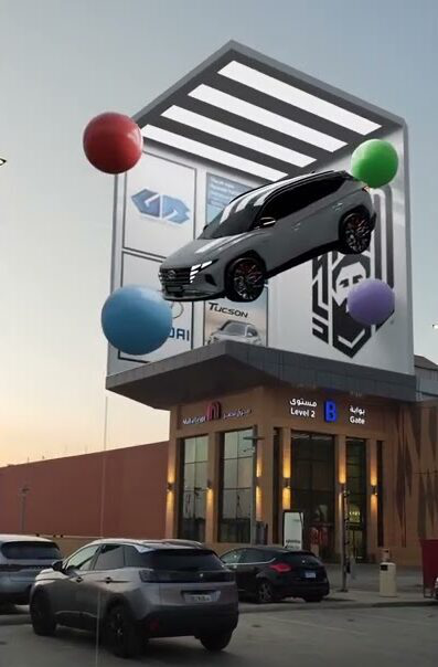
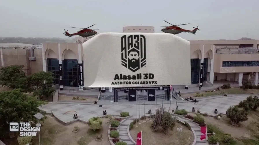
One common technique is tracking animation. This is where the text doesn’t just move; it follows something in the scene, often distorting in perspective. Think of text appearing on a moving car or tracking onto a wall that the camera is panning across. The text has to deform and move exactly as if it were painted onto that real-world surface. This is where good tracking data from the original footage is essential, and then you apply that data to your text elements so they stick convincingly.
Another cool area is animating individual letters or even parts of letters. You might have letters tumble, spin, or scatter before forming words. Or maybe the edges of the text glow and flicker independently. This level of detail in animation adds visual richness and complexity. It’s about treating each letter not just as a static shape, but as a dynamic element that can be manipulated.
The key is that the animation should serve the narrative or the visual style. A chaotic explosion of text works for a title sequence about information overload, but not for a serene historical recreation. The animation should feel motivated, like it’s happening *because* of something in the scene or *to* communicate a specific idea or feeling. It’s about motion design with a VFX twist, deeply integrated into the live-action plate.
See examples of compelling motion design
The Nitty-Gritty: Integration and Realism
Making text look like it’s *actually* in the scene is often the hardest part of The Art of VFX Typography. It’s not enough for the text to move correctly; it has to look like it’s being affected by the same things as the rest of the environment.
Lighting is a big one. If the scene is lit by a warm sunset, your text needs to reflect that warm light. If there’s a strong blue light source on one side, the text needs a blue highlight there. If it’s 3D text, you’re creating virtual lights in your 3D scene that mimic the real-world lights. If it’s 2D text, you might add color overlays or gradients in compositing. You also need to consider shadows. Does the text cast a shadow on the wall behind it? Does an object in the scene cast a shadow *on* the text? Getting shadows right adds a huge amount of realism.
Reflections and Speculars are another crucial element. If your text is metallic or shiny, it needs to reflect the environment around it. If there’s a bright light source, you need to see a specular highlight on the text. This often requires building a simplified 3D environment or using reflection maps derived from the original footage. It’s about making the material properties of your text look convincing.
Atmospheric Effects play a big role too. Is there fog or haze in the scene? Your text needs to look like it’s sitting within that atmosphere. Is there dust or rain? The text might need to look slightly obscured or have rain droplets running down it. This is handled in compositing, adding layers of effects to integrate the text into the plate’s environment.
Depth of Field and Motion Blur are essential for matching the look of the camera. If the original footage has parts that are out of focus, your text also needs to go out of focus when it’s at the same depth. If the camera or the text is moving fast, you need to add realistic motion blur. These are technical parameters you match from the original footage to your CG elements.
And then there’s the subtle stuff, like matching the film grain or digital noise of the original footage. If your perfectly clean CG text is composited onto grainy film, it will stick out like a sore thumb. Adding matching grain is a small step that makes a huge difference in realism.
This meticulous process of matching every visual property of the CG element to the live-action plate is what separates text stuck onto a video from text that genuinely feels like part of the scene. It requires patience, attention to detail, and a good understanding of how light and physics work in the real world, and how to replicate that digitally. It’s a significant part of mastering The Art of VFX Typography.

Common Challenges and How We Tackle Them
Trust me, it’s not always smooth sailing. The Art of VFX Typography comes with its own headaches. One of the biggest is always tracking. Getting text to stick perfectly to a surface that’s moving and deforming, or in a shot with extreme camera shake, can be maddening. Sometimes the automated trackers don’t work, and you have to manually track points frame by frame. It’s tedious but necessary for realism. If the tracking is off, even by a pixel, the illusion is broken.
Another challenge is readability vs. coolness. You want the text effect to look amazing, maybe exploding dramatically. But if the audience can’t read what it says because it disappears too quickly or is too obscured by the effect, you’ve failed. There’s a constant negotiation between making the text look cool as an effect and ensuring the information it carries is delivered effectively. Sometimes you have to simplify the effect or make the text bolder for a few frames to ensure readability.
Integration with tricky plates is also tough. Maybe the original footage is noisy, or compressed, or shot in low light. Matching CG elements to these plates requires skill and often creative workarounds. Getting the colors and lighting to match in a dimly lit, color-graded scene is much harder than in a bright, clean shot.
Client feedback and iterations are part of the process, but they can be challenging, especially if the feedback changes the core concept after you’ve done a lot of work. Learning to interpret feedback (“Can you make it pop more?”) and translate it into technical and artistic changes is a skill in itself.
Dealing with motion blur accurately is surprisingly difficult. Matching the exact amount and direction of blur from the camera’s movement or the object’s movement requires careful calculation and setup in your software. If the CG motion blur doesn’t match the plate’s, the text will look fake, like it’s floating on top. The long paragraph I mentioned earlier could easily delve into the complexities of generating motion vectors for CG elements and ensuring they align perfectly with the motion present in the live-action footage, explaining how different rendering engines handle this, the potential pitfalls like ‘streaking’ or inaccurate blur amounts if the shutter speed isn’t correctly simulated or matched, and the compositing techniques used to refine or even generate motion blur when render passes aren’t sufficient, illustrating how this seemingly simple concept of blur is actually a deep rabbit hole involving camera physics, rendering theory, and meticulous compositing adjustments, often requiring multiple test renders and comparisons against the original plate, layer by layer, channel by channel, ensuring that not only the visible text element but also any generated mattes or utility passes carry the correct motion data for downstream processing, and further still, considering the interaction of motion blur with other effects like transparency, depth of field, or particle systems originating from the text, each adding another layer of complexity to achieve a truly photorealistic result where the text appears to be moving with the same characteristics as every other physical object captured by the camera in that specific take, under those specific lighting conditions, and with that specific lens and shutter setup, a level of detail that is often invisible to the casual viewer but absolutely essential for maintaining the suspension of disbelief in high-end visual effects work, underpinning the seamless integration that is the hallmark of professional VFX typography, a process that can take hours, if not days, for a single complex shot, demonstrating that while the core idea might be simple movement, the execution involves a deep technical understanding of how image formation and capture works, and how to replicate those phenomena digitally, making it a prime example of the blend of artistry and engineering required in this field. See? That’s a long paragraph about motion blur! It shows how a seemingly small detail in The Art of VFX Typography can be quite involved.
Overcoming these challenges requires patience, problem-solving skills, and a willingness to experiment. You try something, see if it works, and if not, you figure out why and try a different approach. It’s a constant learning process.

Read about the latest trends and techniques in VFX
My “Aha!” Moments in The Art of VFX Typography
Looking back over the projects I’ve worked on, big and small, there have definitely been moments where something just clicked and I felt like I leveled up in understanding The Art of VFX Typography. One early one was realizing that tracking wasn’t just about sticking the text to a point; it was about making the text *live* in the 3D space of the shot. Once I started thinking about the text as a real object in that environment – considering its position relative to other things, how it would be lit from the scene’s lights, how it would get blocked by foreground objects – the integration got miles better. It wasn’t just about hitting ‘solve’ on the tracker; it was about refining that solve and using it to inform how I placed and lit the text.
Another big moment was understanding the importance of motion blur, which I talked about in that very long paragraph. Early on, I’d render text without much motion blur, and it always looked too sharp and fake, especially in fast-moving shots. Learning to match the plate’s motion blur, even if it meant longer render times, was a game-changer for realism. It’s one of those subtle cues our brains pick up on to tell if something is real or CG.
And a third one was truly appreciating the power of subtle effects in compositing. Initially, I’d think, “Okay, the text is rendered, I’ll just put it on top.” But adding subtle glows, halation (light bleeding around bright edges), lens distortion, chromatic aberration (color fringing), or even a touch of atmospheric haze could completely transform a CG element and make it feel like it was captured by the same camera at the same time as the live-action. It’s often the little things that make the biggest difference in achieving believable The Art of VFX Typography.
Thinking About the Future of Text in VFX
Where is The Art of VFX Typography headed? I think we’re going to see even deeper integration and more sophisticated ways for text to interact with the environment. Augmented reality overlays in films or shows, where text appears to float in the real world as seen through a character’s eyes or a device, are becoming more common and require incredibly precise tracking and rendering. We might see more procedural effects, where text animates and transforms based on data or simulations in increasingly complex ways. Think about dynamic data visualization built directly into narrative scenes.
As real-time rendering engines become more powerful, we might see more VFX typography happening live on set or during production, allowing directors to see the final integrated text elements earlier in the process. And I expect we’ll see even more creativity in how text itself is designed and animated, moving beyond standard letterforms into more abstract or organic shapes that still convey meaning or mood.
Ultimately, The Art of VFX Typography will continue to be about finding new and compelling ways to use text as a visual storytelling element, blending information delivery with stunning visual effects to create truly immersive experiences.
Getting Your Hands Dirty: Tips for Beginners
If you’re just starting out and this sounds interesting, here are a few tips based on my own journey in The Art of VFX Typography:
- Start Simple: Don’t try to blow up text into a million pieces on day one. Start with basic tracking and compositing. Try putting simple text onto a wall that the camera is panning across. Learn to match the perspective and motion blur.
- Master Tracking: Seriously, spend time learning how to track footage. Whether it’s 2D, 3D, or planar tracking, it’s a foundational skill for putting anything into a live-action shot, especially text.
- Pay Attention to Detail: Look closely at how text appears in movies and shows you admire. How is it lit? Does it cast shadows? How much motion blur does it have? Try to analyze *why* it looks good.
- Learn Compositing Basics: Understanding how to layer elements, adjust colors, add glows, and match grain is essential for making your text look like it belongs in the shot.
- Experiment with Animation: Play around with different ways text can appear and disappear. Don’t just use fades. Try animating position, rotation, scale, and experimenting with different timing and easing.
- Study Typography: Even though it’s VFX, understanding basic typography principles – like font pairings, leading, and kerning – will make your text elements look much more professional *before* you even start adding effects.
- Be Patient: VFX can be time-consuming and frustrating. Some shots take hours or days just for tracking or rendering. Stick with it, break down complex tasks into smaller steps, and don’t be afraid to try different approaches.
The Art of VFX Typography is a rewarding field that combines technical skill with creative design. It’s about making words come alive on screen in ways that enhance the story and immerse the viewer. It’s a fantastic corner of the visual effects world to explore.
Bringing It All Together
Stepping back and looking at The Art of VFX Typography as a whole, it’s clear it’s much more than just a functional task. It’s a creative craft that requires a blend of design sense, technical proficiency, and a keen eye for detail. From choosing the perfect typeface to meticulously tracking it onto a complex surface, from designing a dramatic animation to ensuring it blends seamlessly with the lighting and atmosphere of the scene, every step is about making text work harder for the story.
My journey through this part of the VFX landscape has been one of constant learning and problem-solving. There’s always a new challenge – a difficult track, a tricky lighting scenario, or a creative effect that needs figuring out. But that’s what keeps it interesting. The satisfaction of seeing text you’ve designed and animated sit perfectly within a shot, adding information or enhancing the mood without pulling the audience out of the moment, is immense. It’s proof that even something as fundamental as text can be transformed into a powerful visual effect, a key element in the cinematic illusion. The Art of VFX Typography is subtle, powerful, and an indispensable part of modern visual storytelling.
For anyone interested in diving deeper into visual effects or motion design, exploring how text is used and integrated into live-action can open up a whole new world of creative possibilities. It’s a skill set that’s always in demand because text is everywhere, and making it look good in dynamic visual content is harder than it looks.
